ReachInbox
Outbox Labs · Product Redesign
Introduction
ReachInbox should feel less like a tool and more like a workspace. I rebuilt the UX around what sequence operators actually do all day: draft, review, reply, triage. The time to do it dropped by 80%+, and every surface argues for the next action instead of asking the user to assemble one.
Details
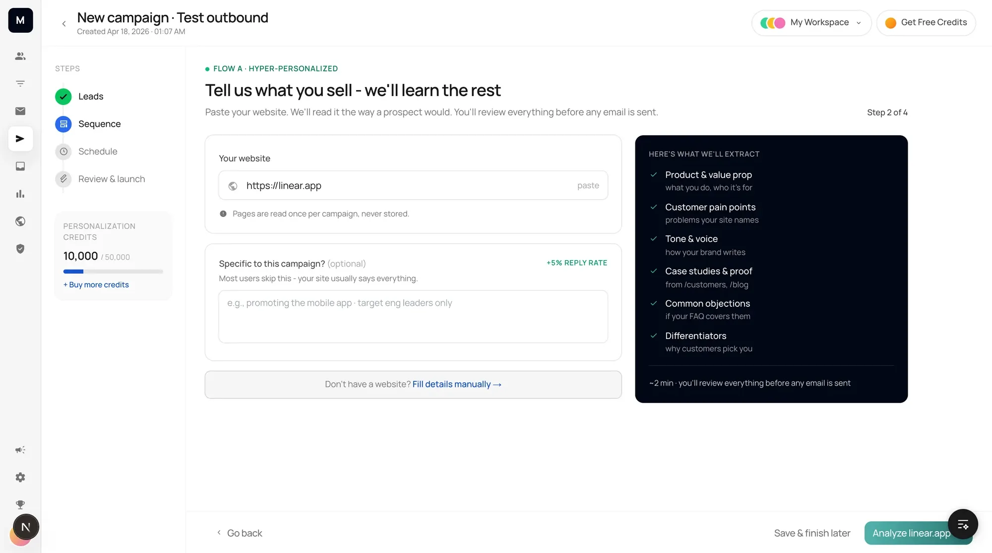
A sequence operator's day is four verbs: draft, review, reply, triage. ReachInbox had a screen for each one and nothing running between them, so most of the work was assembling the tool before using it. The redesign starts from the day rather than the feature list. There is one workspace, one rail, and a campaign wizard that only ever asks the next question.
Drafting splits into three honest paths instead of one generic composer. Paste a site and let the product read it, write a brief and let it draft the sequence, or start from a template. Each path is a route you can walk, and the method you pick is visible in the step bar the whole way through.
One rule shaped every AI surface: nothing the model produces leaves the product without a person in front of it. The batch screen is the gate. It counts what was drafted, says plainly that nothing has been sent, flags the drafts that fell back to generic angles, and only then offers the approve button.
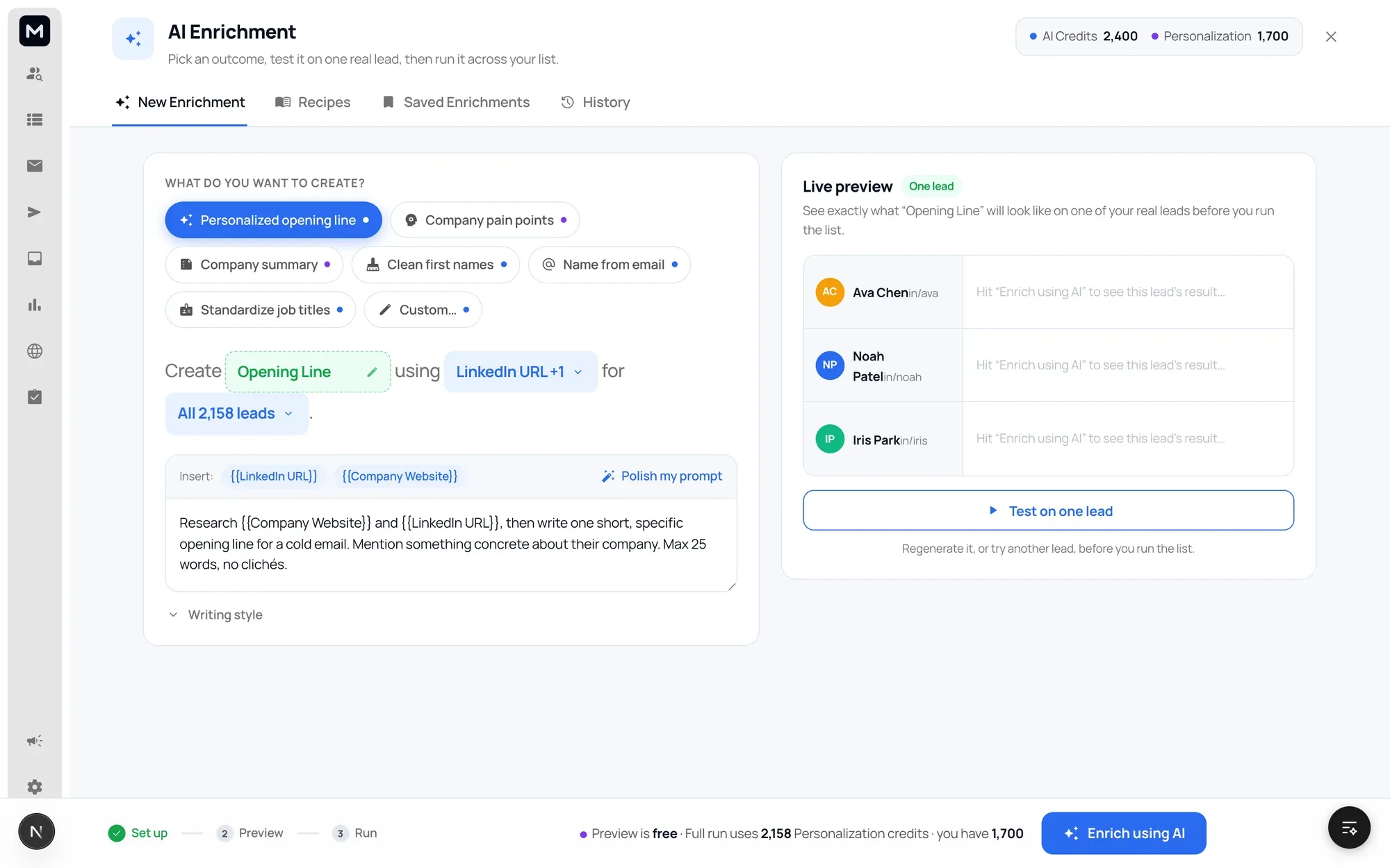
The same rule runs upstream. The hyper-personalised path hands back every field it read off your site, each one labelled with the page it came from, editable before a single email exists. The enrichment studio runs your prompt on one real lead for free before it will spend credits on the list.
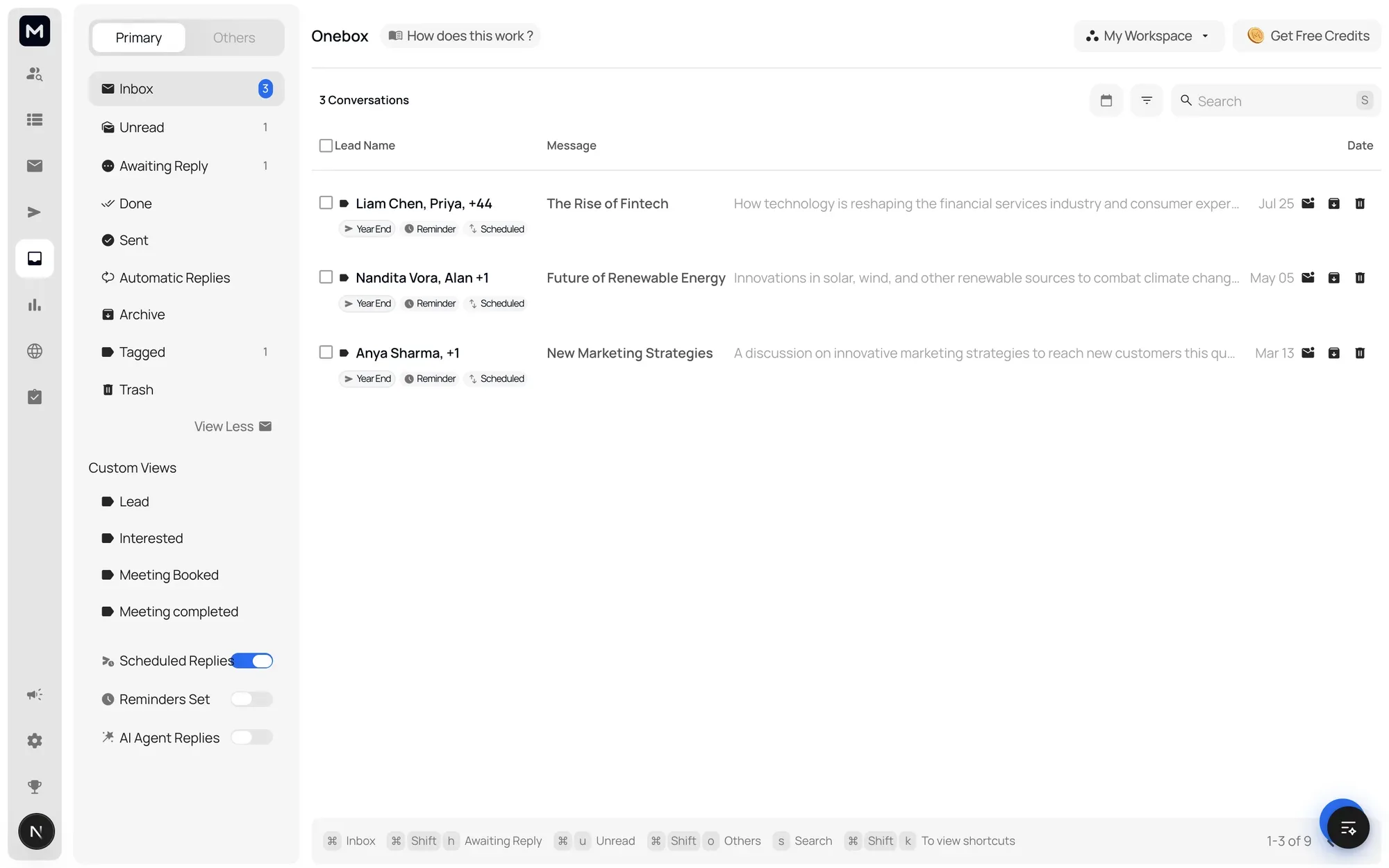
Replies come back into one place, sorted by the states an operator actually works in: unread, awaiting reply, done, sent, plus tags for interested, meeting booked and meeting completed. Scheduled replies, reminders and agent replies are toggles on that same rail rather than a separate product to learn.
The list is keyboard-first and says so. The shortcut bar sits permanently along the bottom of the screen, so the fast way to move is visible while you are still moving the slow way.
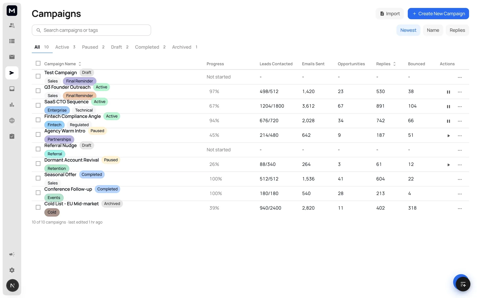
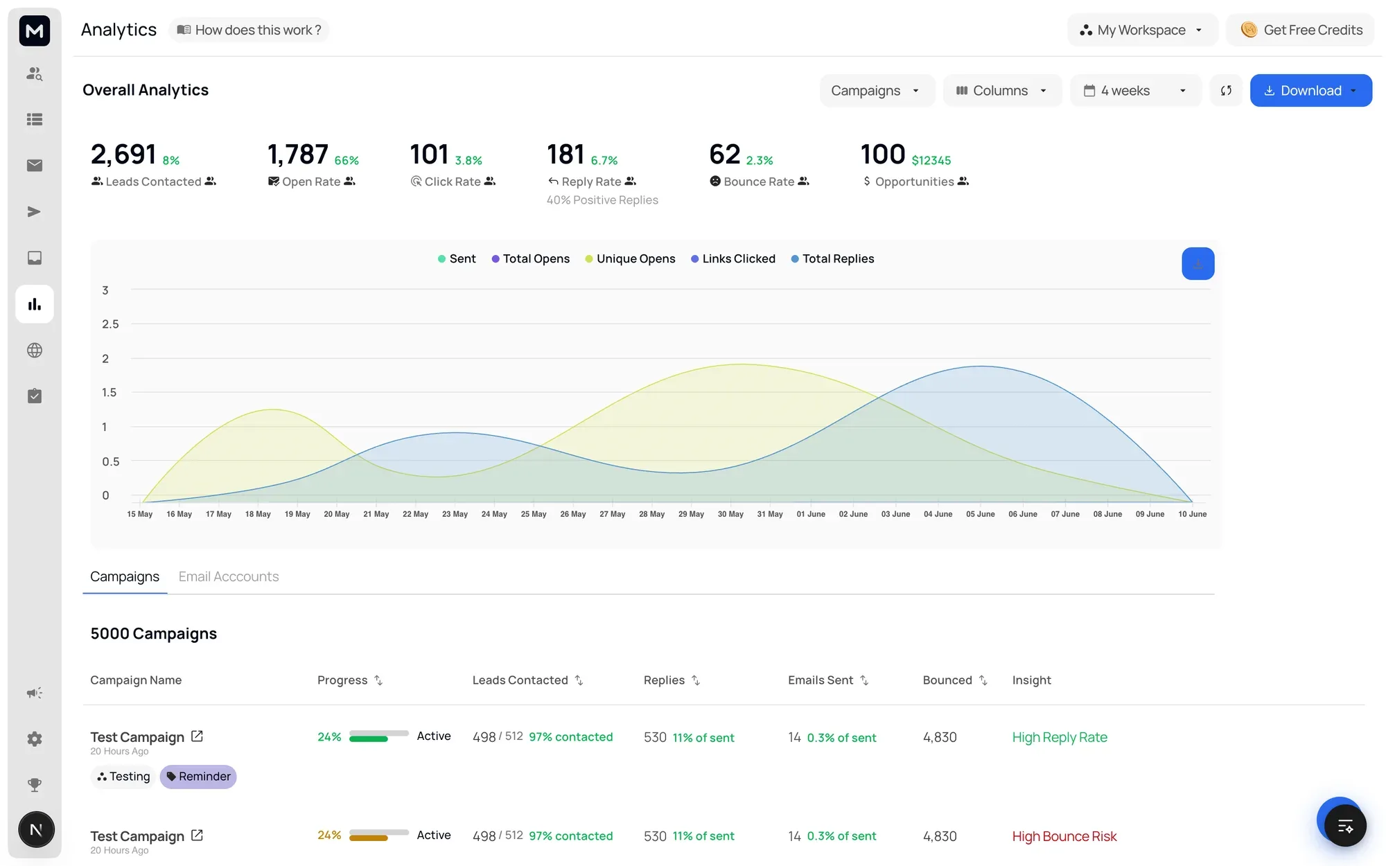
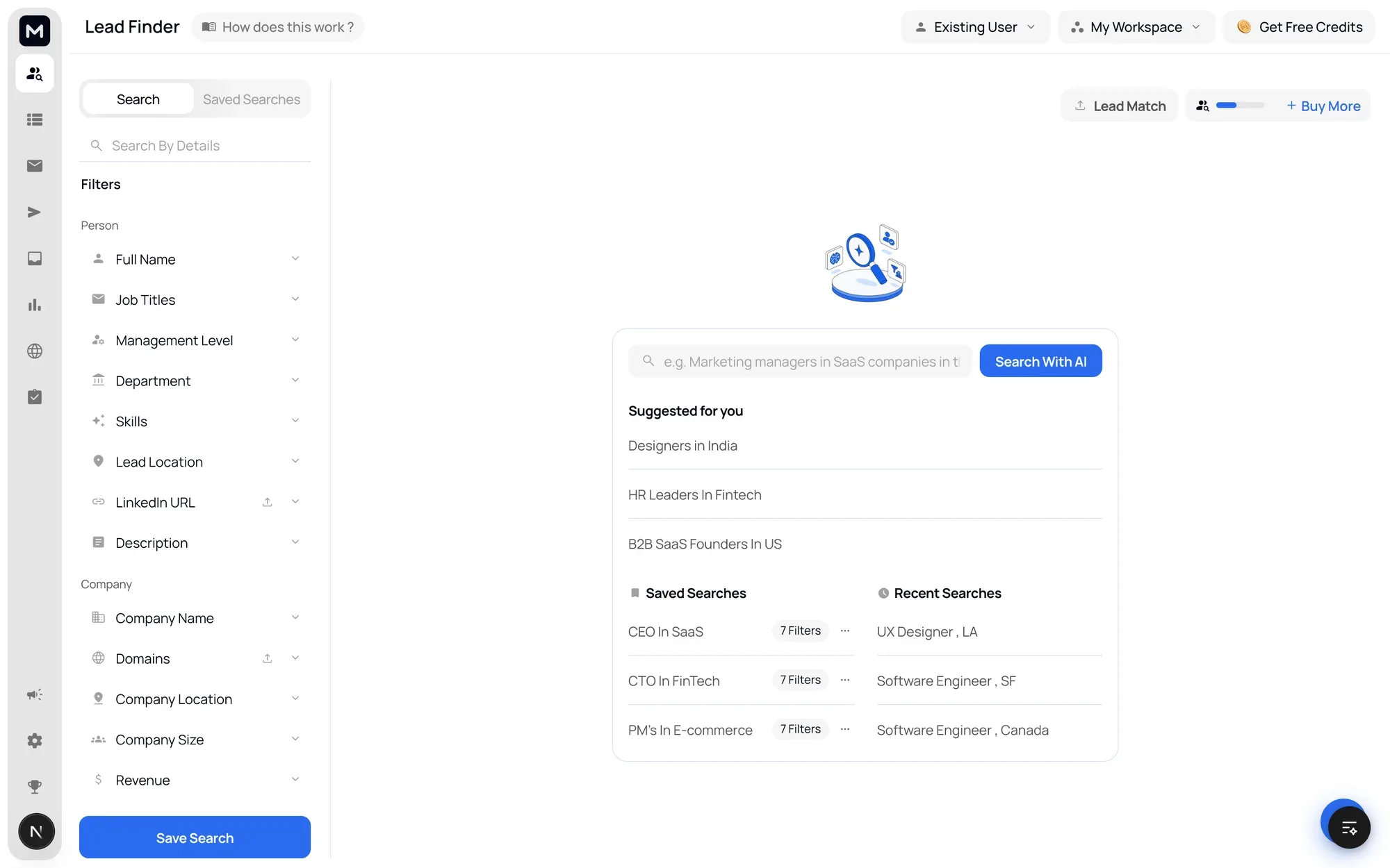
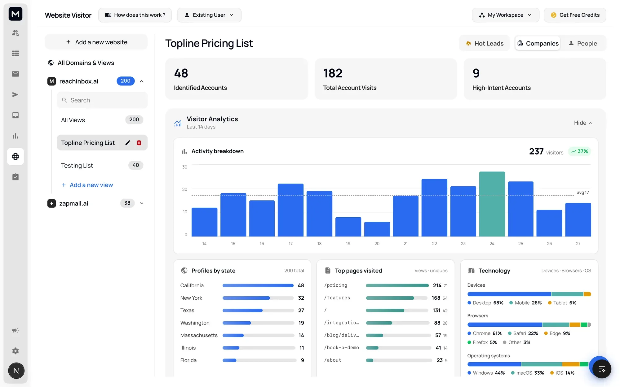
All of it was designed as a clickable prototype rather than a deck: 44 routes, 26 wizard screens across four flows, every rail icon a real link, so a flow could be walked end to end before anyone built it. Competing versions lived at their own URLs and were compared by navigating between them, and every screen carried its own control for switching between filled, empty and loading states, so a reviewer never had to ask to see the empty case.
Twenty numbered friction principles came out of building those flows and now sit alongside the token set and layout anatomy as the written design language. The time to draft, review, reply and triage dropped by more than 80 percent.