ResellerStack
Outbox Labs · 0 → 1 Product
Introduction
Details
Introduction
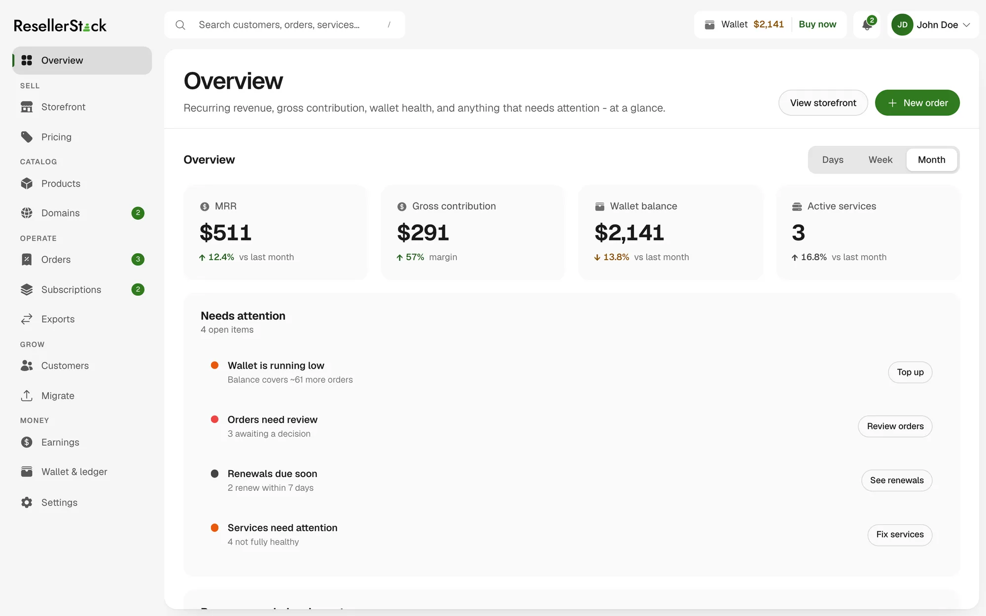
ResellerStack is a concept prototype for the agencies, consultants and web shops that resell domains and business email under their own brand. That trade mostly runs on spreadsheets: you register domains for a book of clients, mark them up by guesswork, and find out at renewal season which of them were actually profitable.
The whole exploration starts from a single decision — make the reseller's margin a first-class number in the interface. Cost, sell price and profit sit side by side on every order, every domain and every renewal, instead of being reconstructed afterwards. Everything else in the product follows from that, including what the interface deliberately refuses to show.
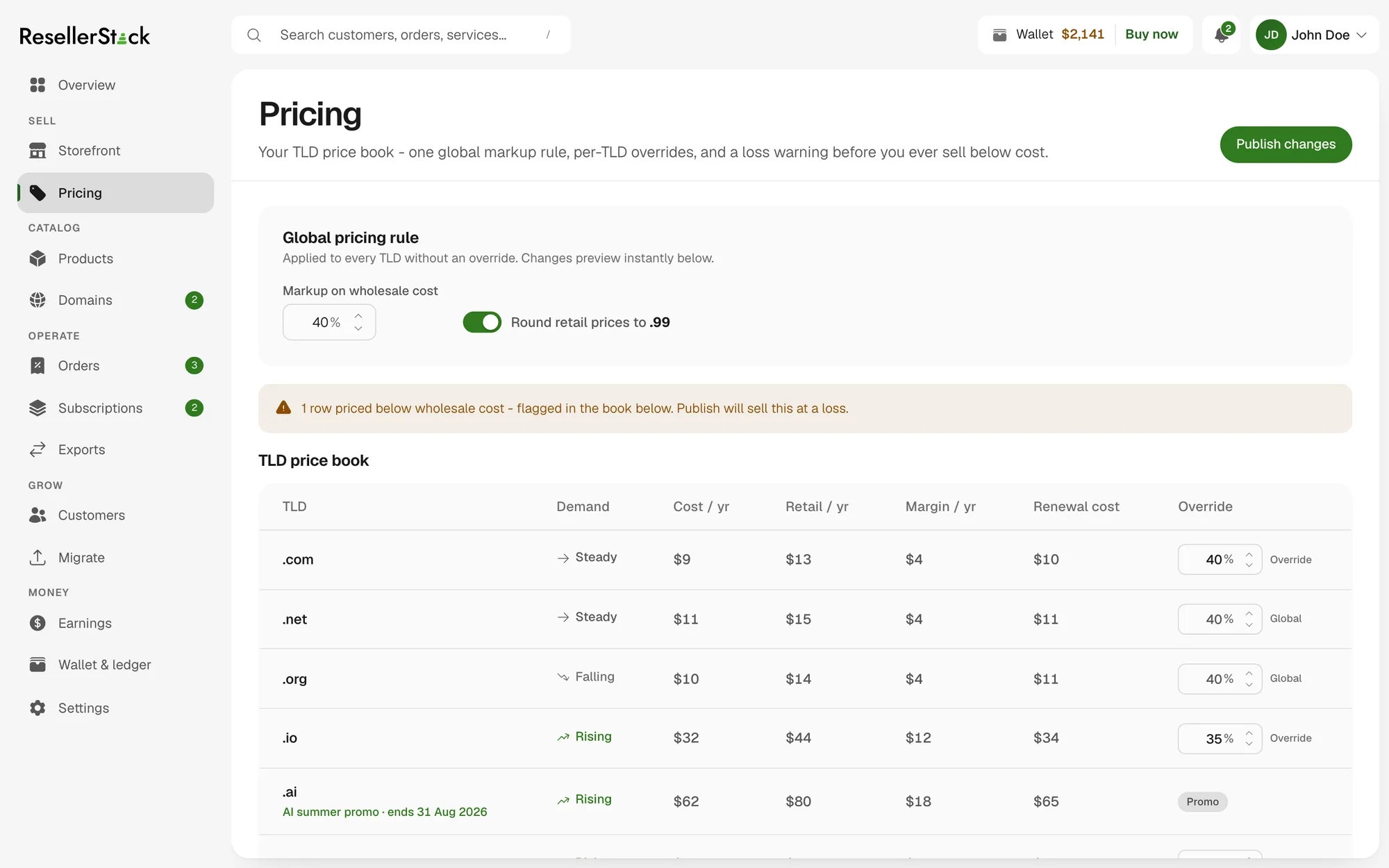
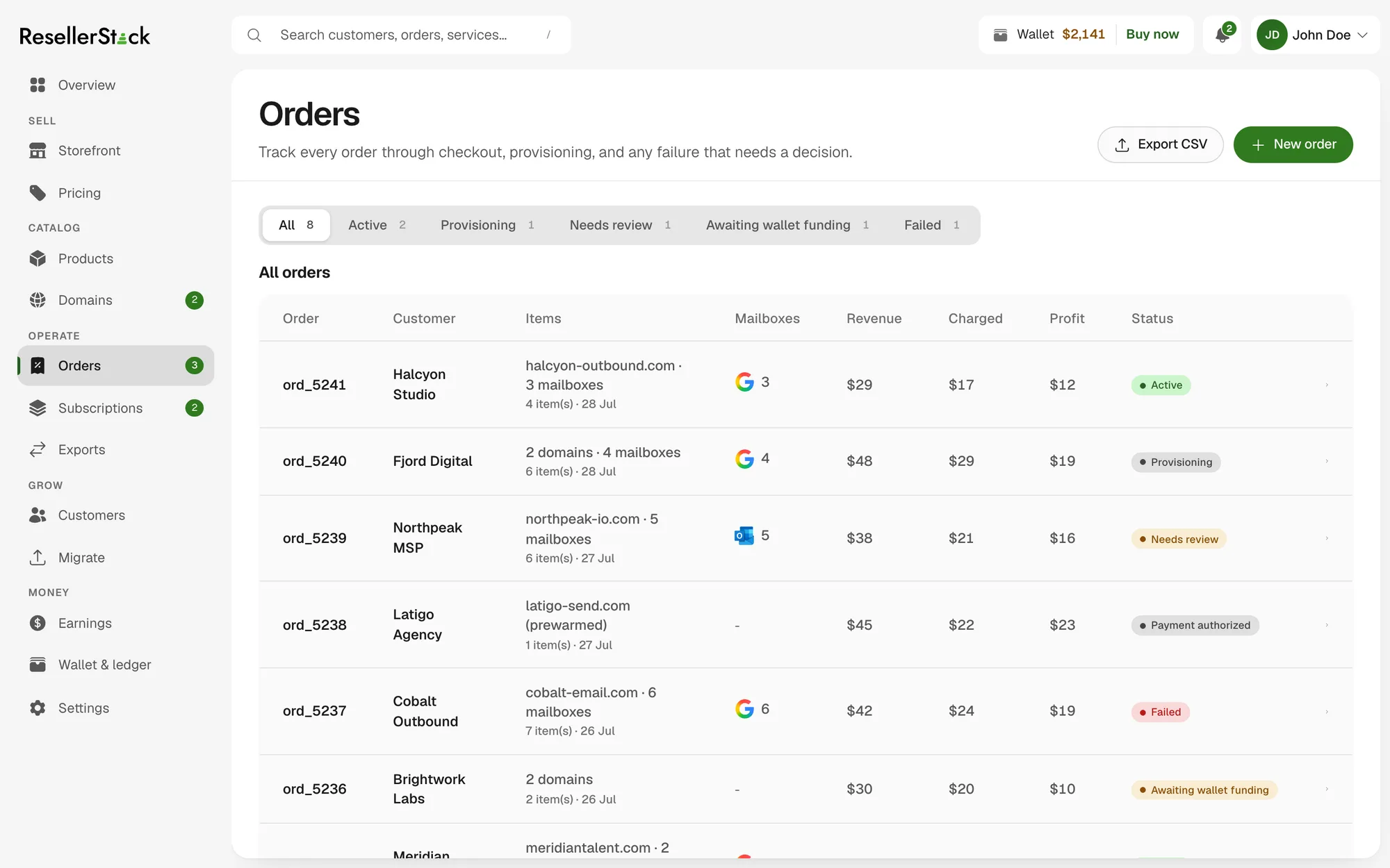
Most reseller panels are an order form with a login. You place the order, the money moves, and profit is something you work out later — per client, in a spreadsheet, usually at renewal when it is too late to reprice.
So the constraint I set was that margin should never have to be reconstructed. Cost, sell price and profit had to appear together on the row you are already looking at, which meant designing the price book as the first screen rather than a settings page, and treating every table in the product as somewhere those three columns have to fit.
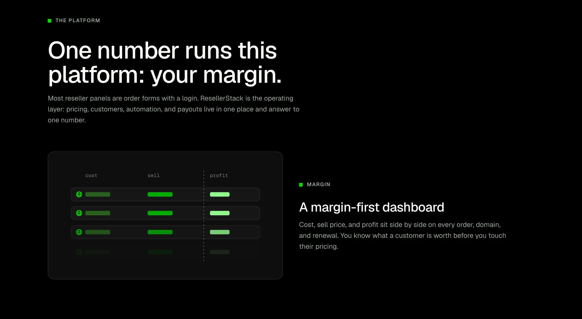
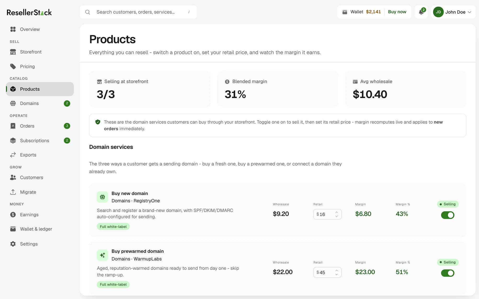
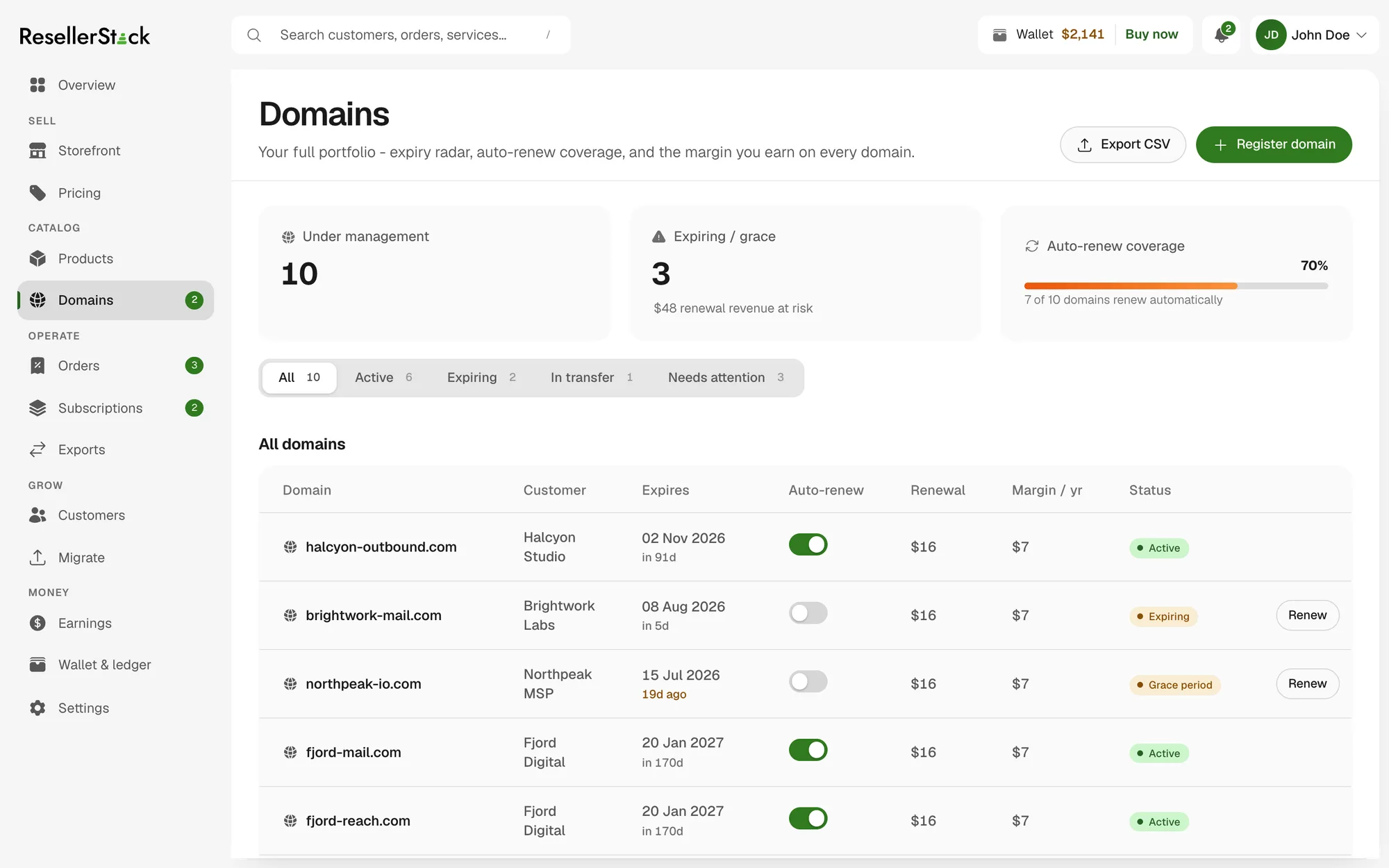
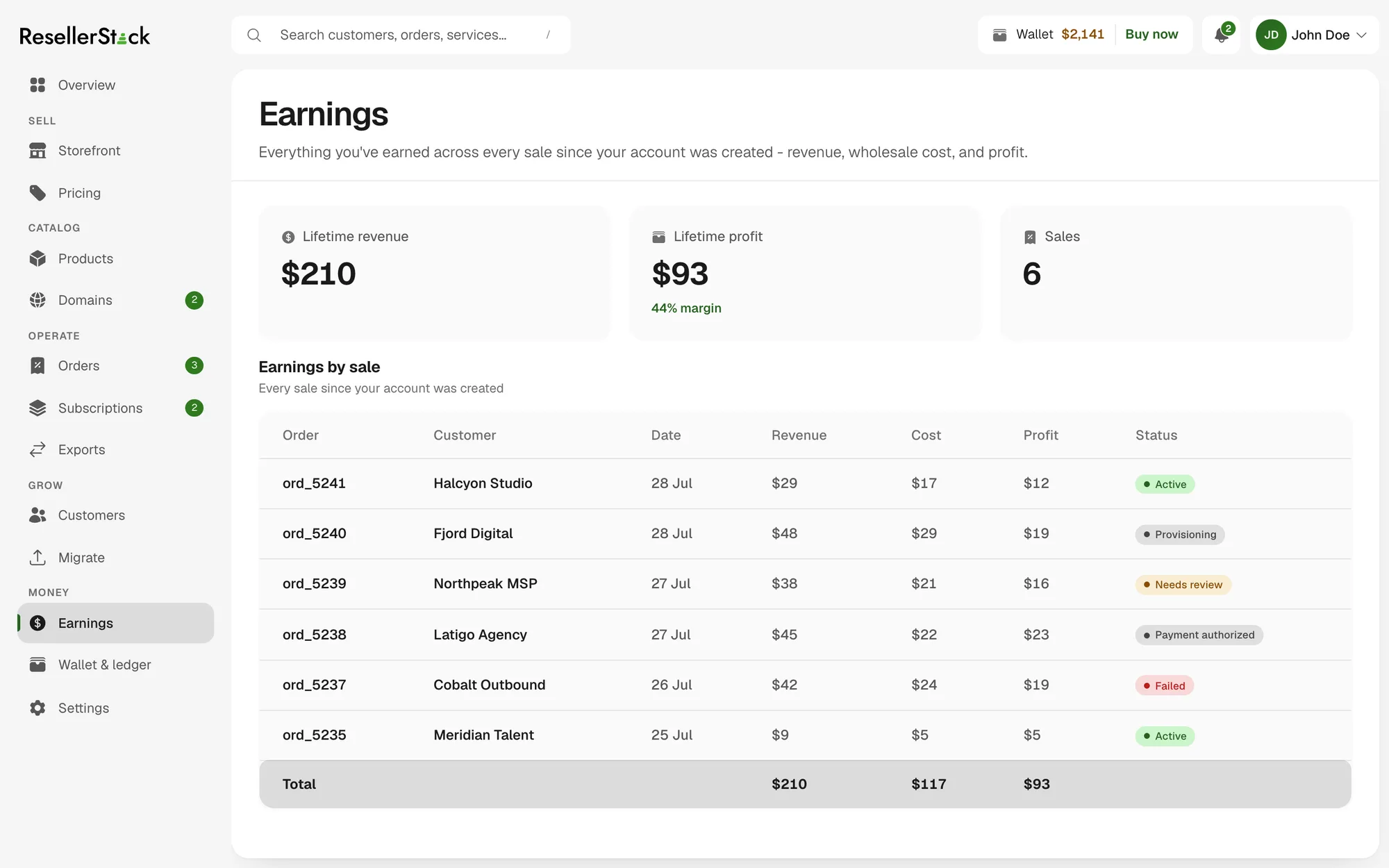
One global markup rule sets the whole book, per-TLD overrides handle the exceptions, and a warning fires before you publish a rule that would sell below wholesale — the mistake the screen exists to prevent. From there the same three columns follow the object through the product: the catalog row you switch on, the domain sitting in a client's portfolio, the totals at the foot of the earnings table.
The business model has a sharper consequence for the interface. Because the model is the spread — you pay wholesale, you set retail, the difference is yours — there is no monthly fee, no seat count and no minimum. So there is deliberately no pricing tier table anywhere in the UI. A plan grid would describe a product this isn't, so the pricing page had to be an explanation instead.

The pricing page, with no plan grid on it — the one place the model had to be argued rather than tabulated.

The studio: blocks, not a blank canvas.

The same draft through the same renderer the published store uses.
Resellers arrive through whichever door fits, and all three doors share one catalog, one wallet and one price book: a no-code hosted storefront, the dashboard itself, or an API-first integration. The storefront is deliberately not a page builder — it is a theme catalog plus data-driven layout and checkout settings, so the controls stay generic and the output stays coherent. Its preview route runs the same renderer and the same store as a published storefront, which is what makes preview trustworthy rather than approximate.
Setup forks on that choice immediately after signup, and the control panel behind it is thirteen screens driven from a single list in code — the same list supplies the route's valid slugs, the sidebar groups and every page header, so a screen cannot exist in the navigation and not in the router.
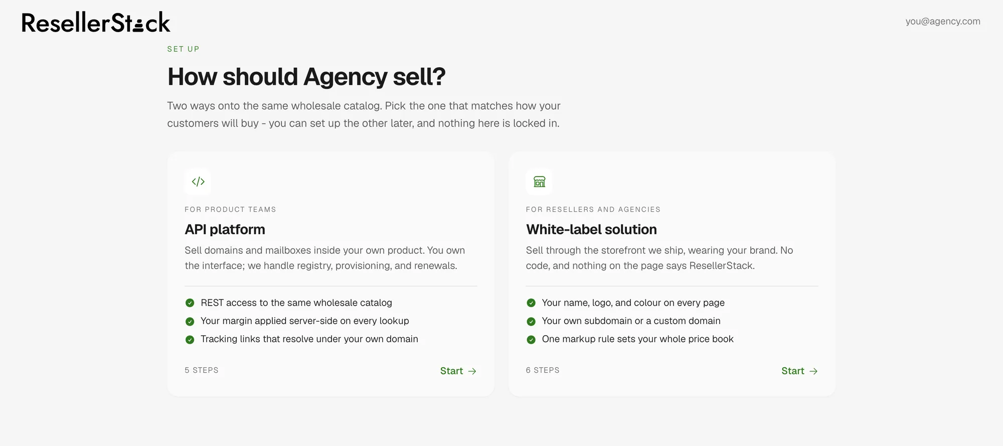
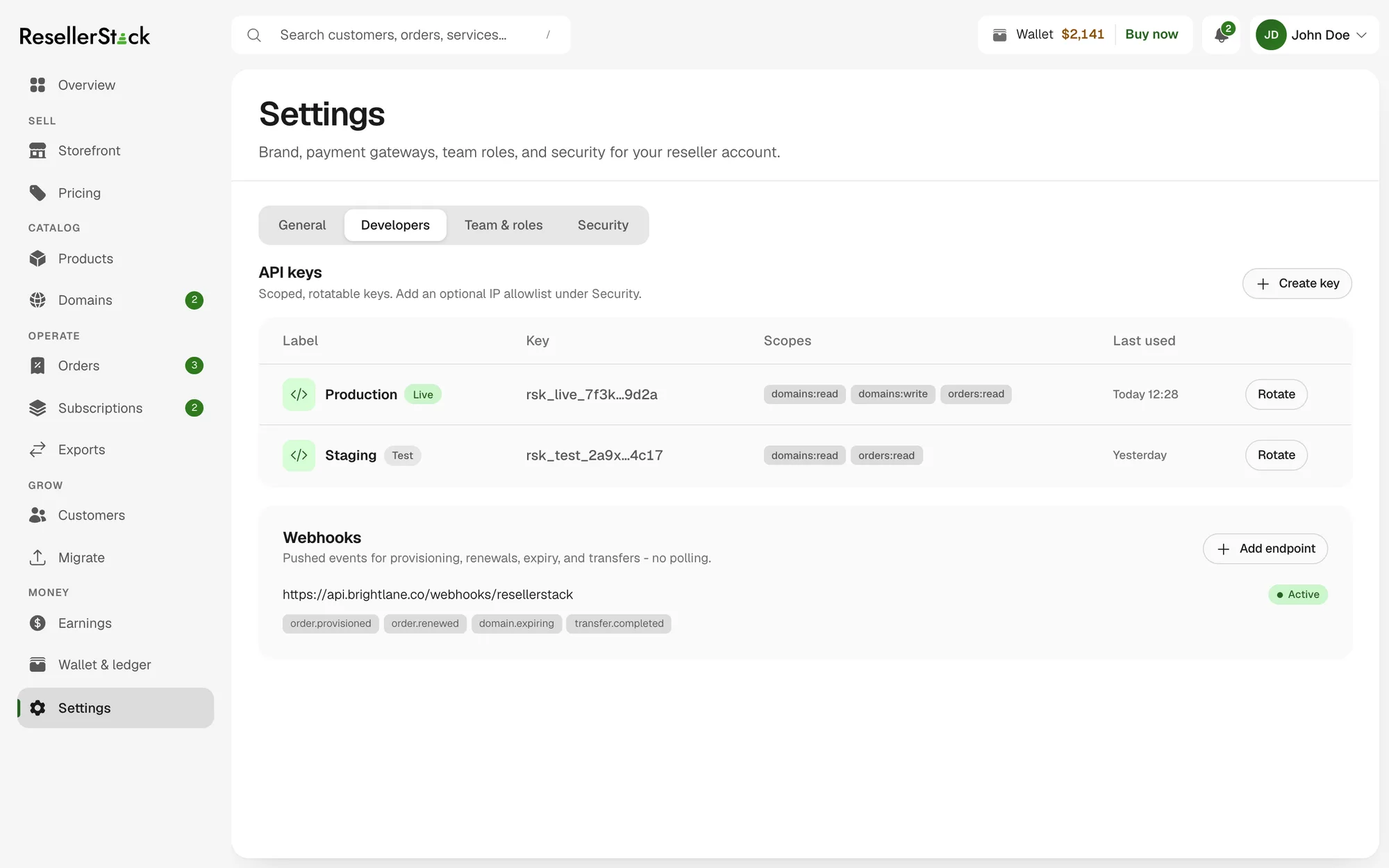
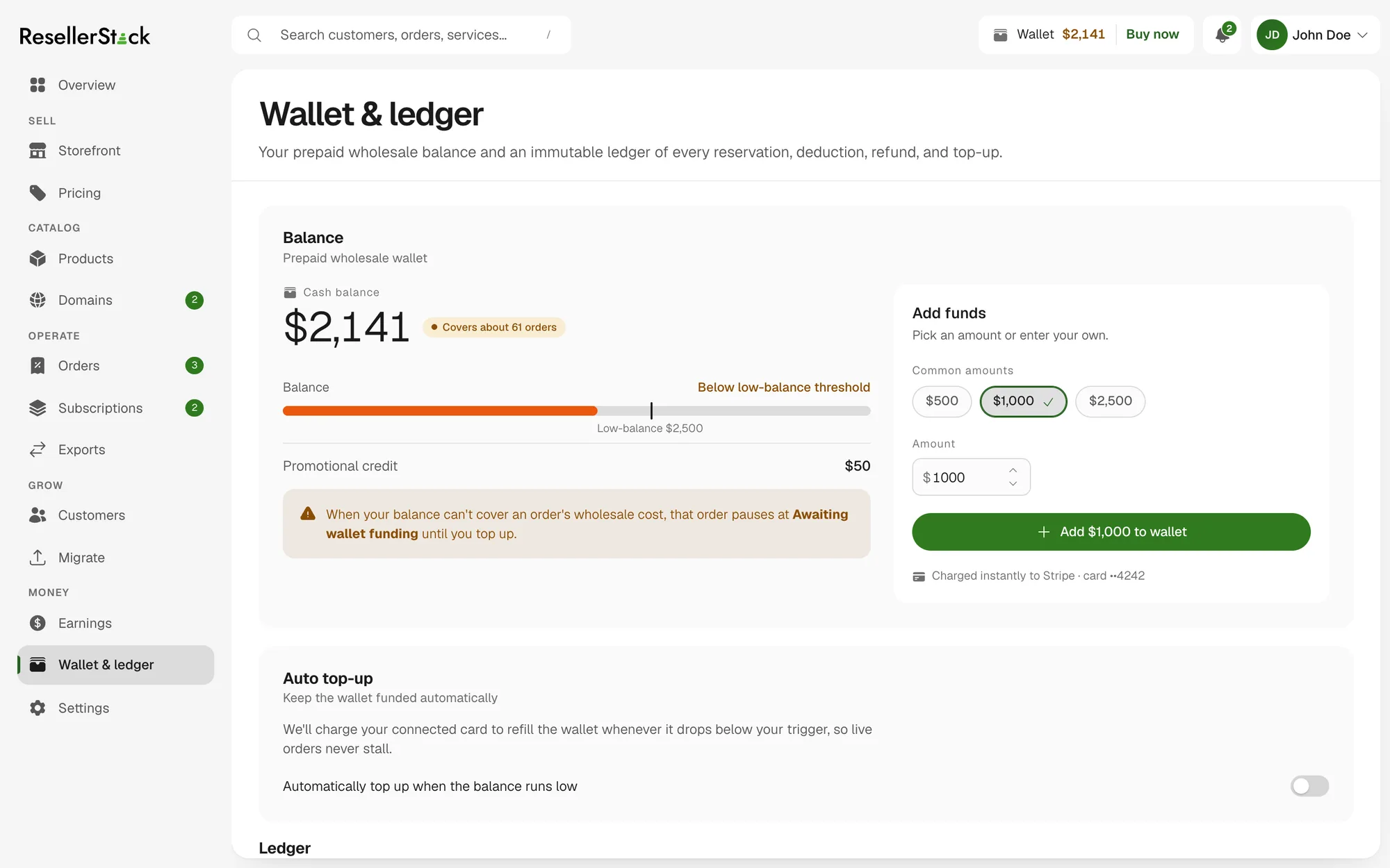
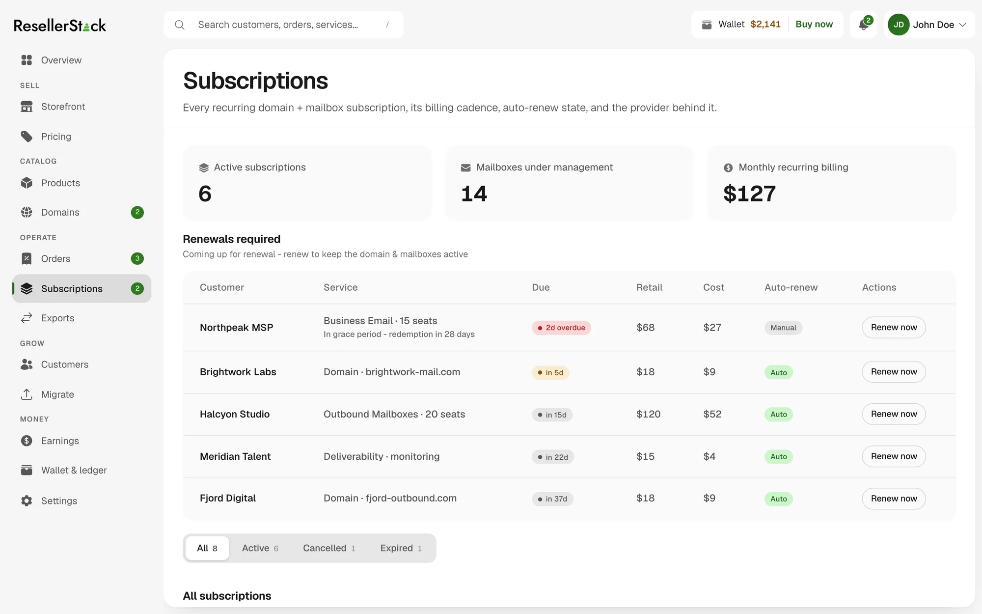
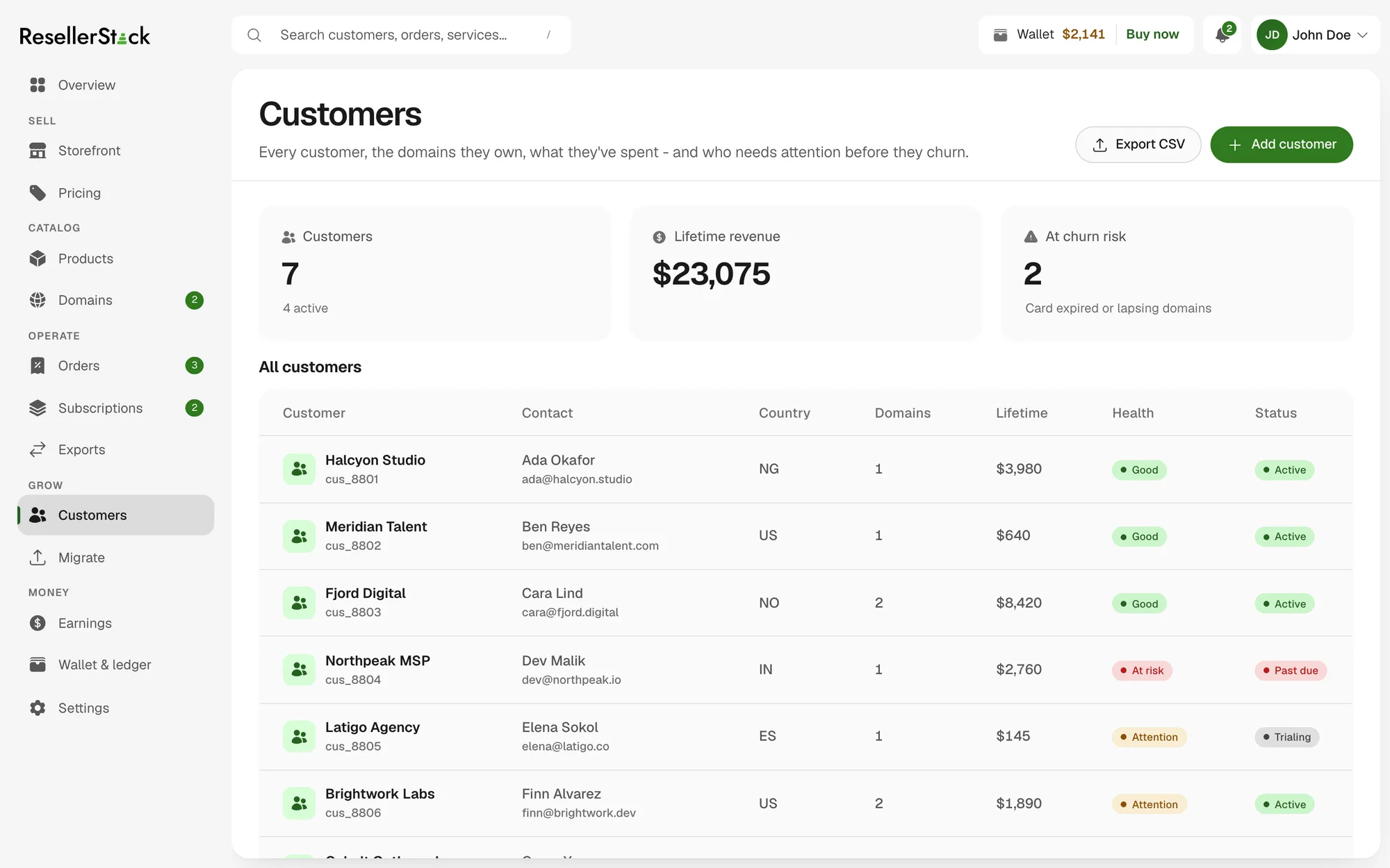
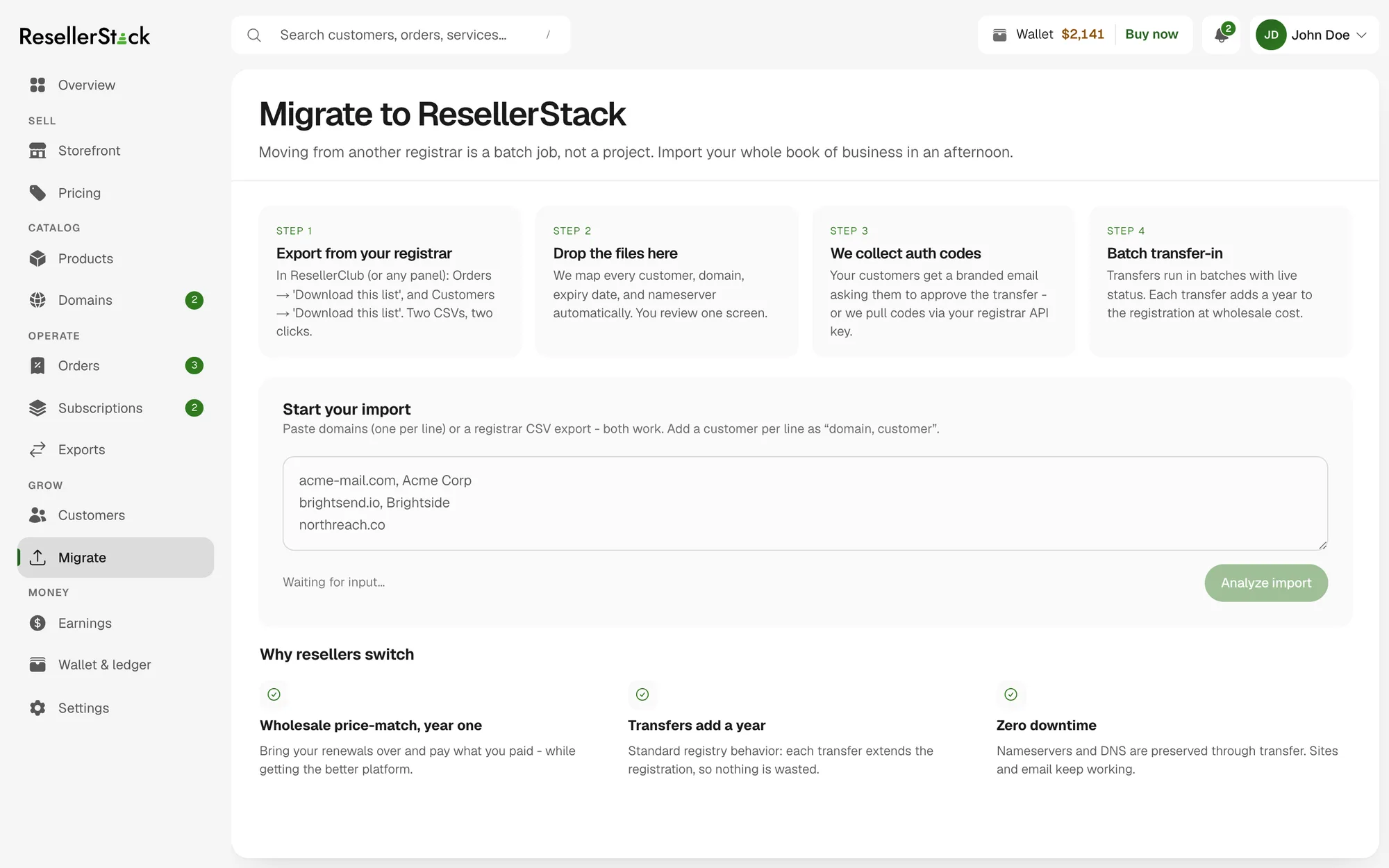
Three weeks produced the whole surface: thirteen control-panel screens, a storefront studio, the customer-facing store it publishes, the setup flow that forks between the two ways in, and a marketing site that argues for the model rather than listing plans.
What it is not, is a business. There is no backend, no registrar integration and no payment processing — state lives in the browser, the catalog and ledger are seed data, and every figure, price and quote in the UI is illustrative and needs sourcing before any of it is published. The deployment sits behind a six-digit gate for exactly that reason. It is a product argument rendered at full fidelity, which is a different thing from a running service, and worth being plain about.