SellerApp
SellerApp · Product Redesign
Introduction
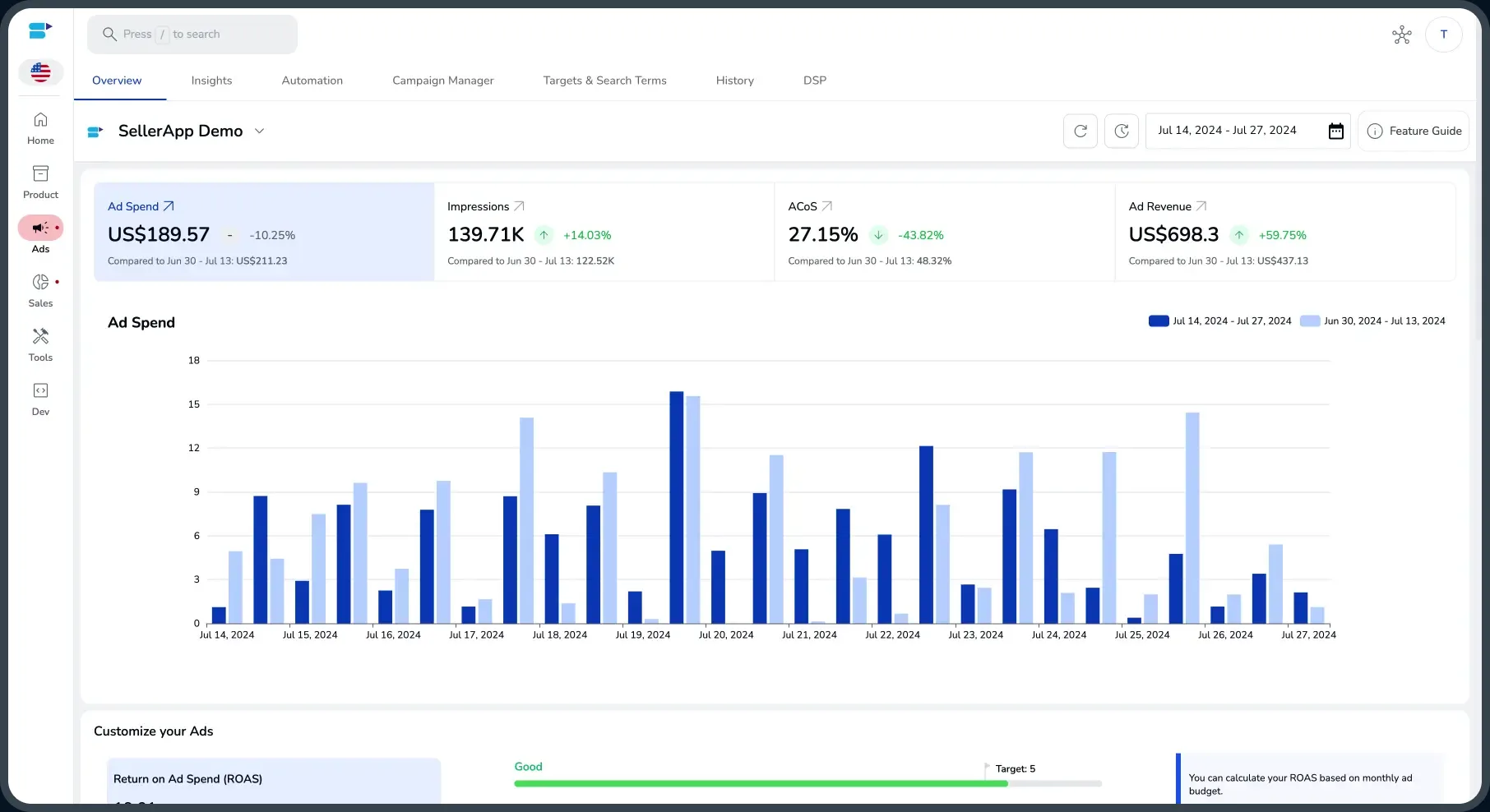
SellerApp's product lived across a dozen tabs. I rebuilt it as a single workspace that covers ads, inventory, listings, and analytics, tuned to the seller's day rather than the data model. A fully responsive, automated design system carried that same logic into a refreshed marketing site and net-new growth assets.
Details
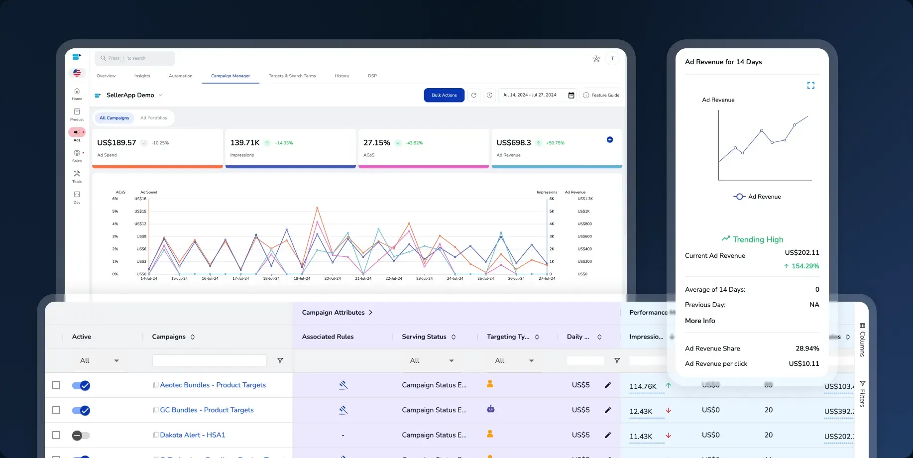
Every answer a seller needed lived somewhere else. Campaign spend in one screen, wasted search terms in another, product and sales health somewhere else again — each with its own filters, its own date picker, its own idea of what a campaign was. The data was all there. What was missing was a place to put it.
The rebuild starts from the seller's day rather than the data model. A persistent rail holds the account — Home, Product, Ads, Sales, Tools — and inside Ads a single row of tabs carries Overview, Insights, Automation, Campaign Manager, Targets & Search Terms, History and DSP. Work stops moving between products and starts moving between tabs that share one account, one date range and one set of numbers across the top.
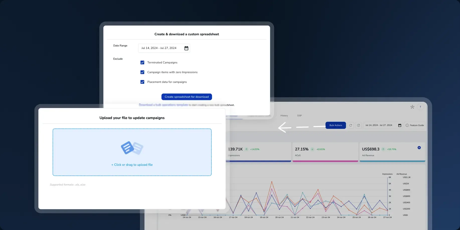
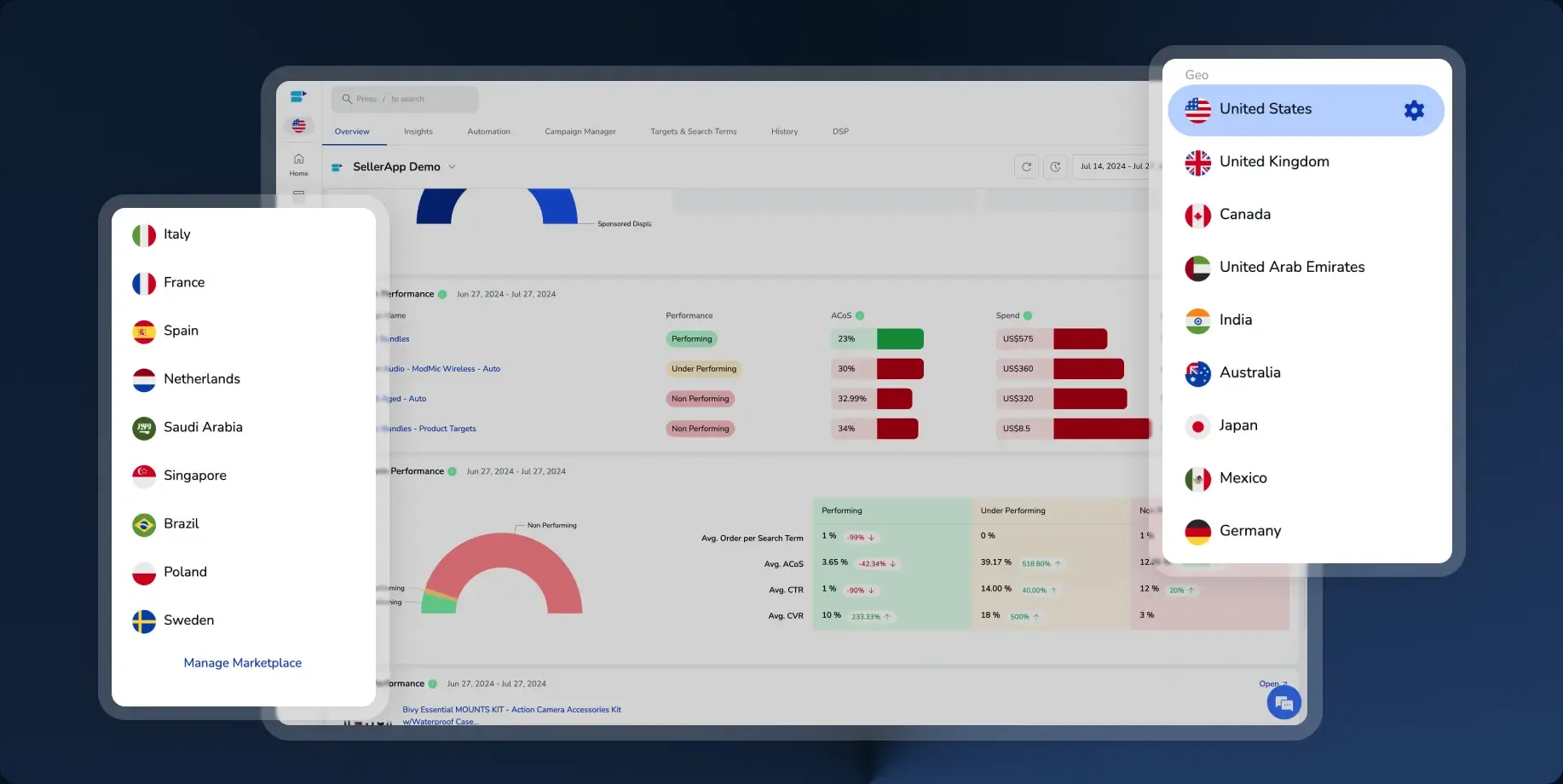
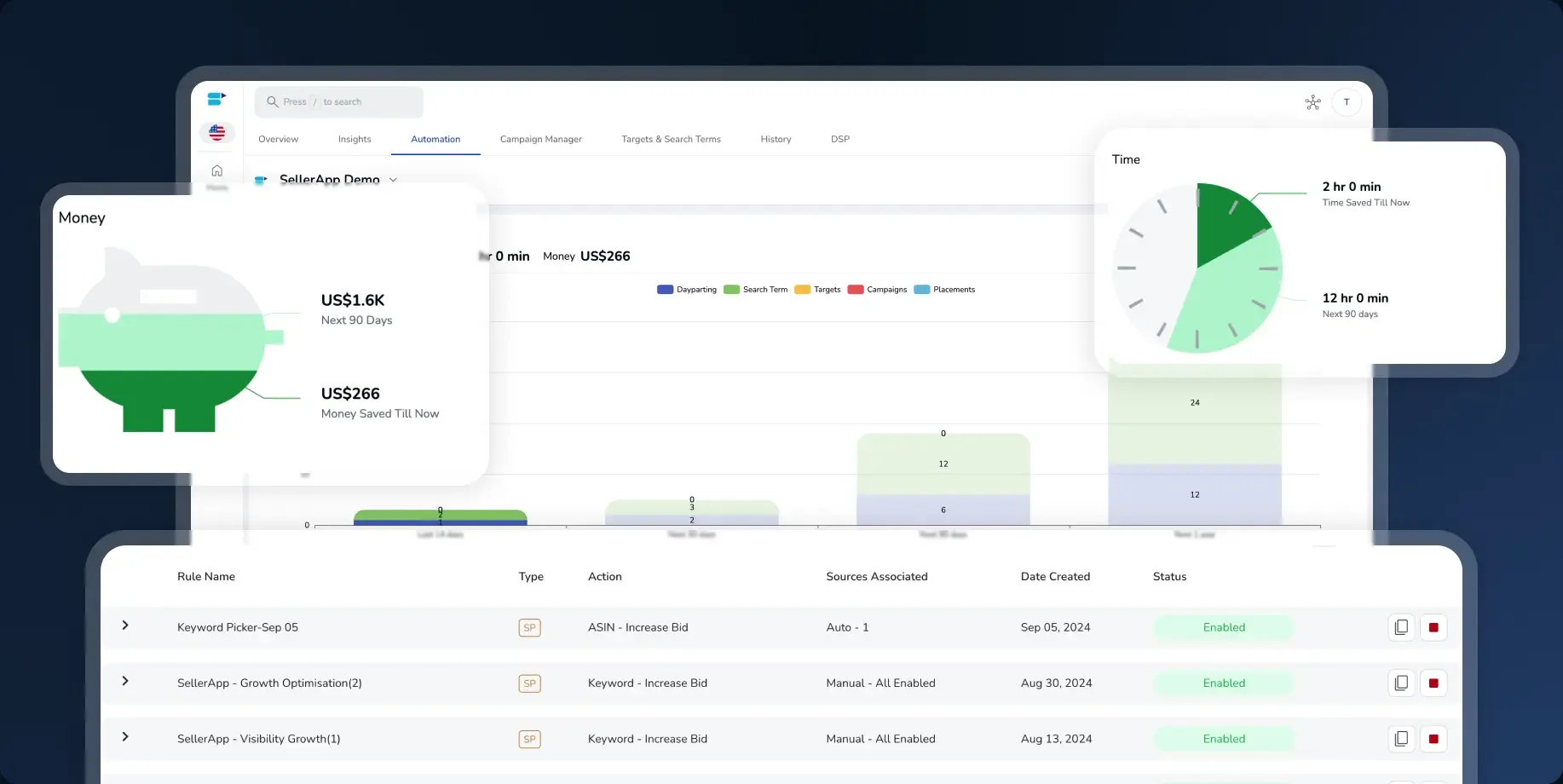
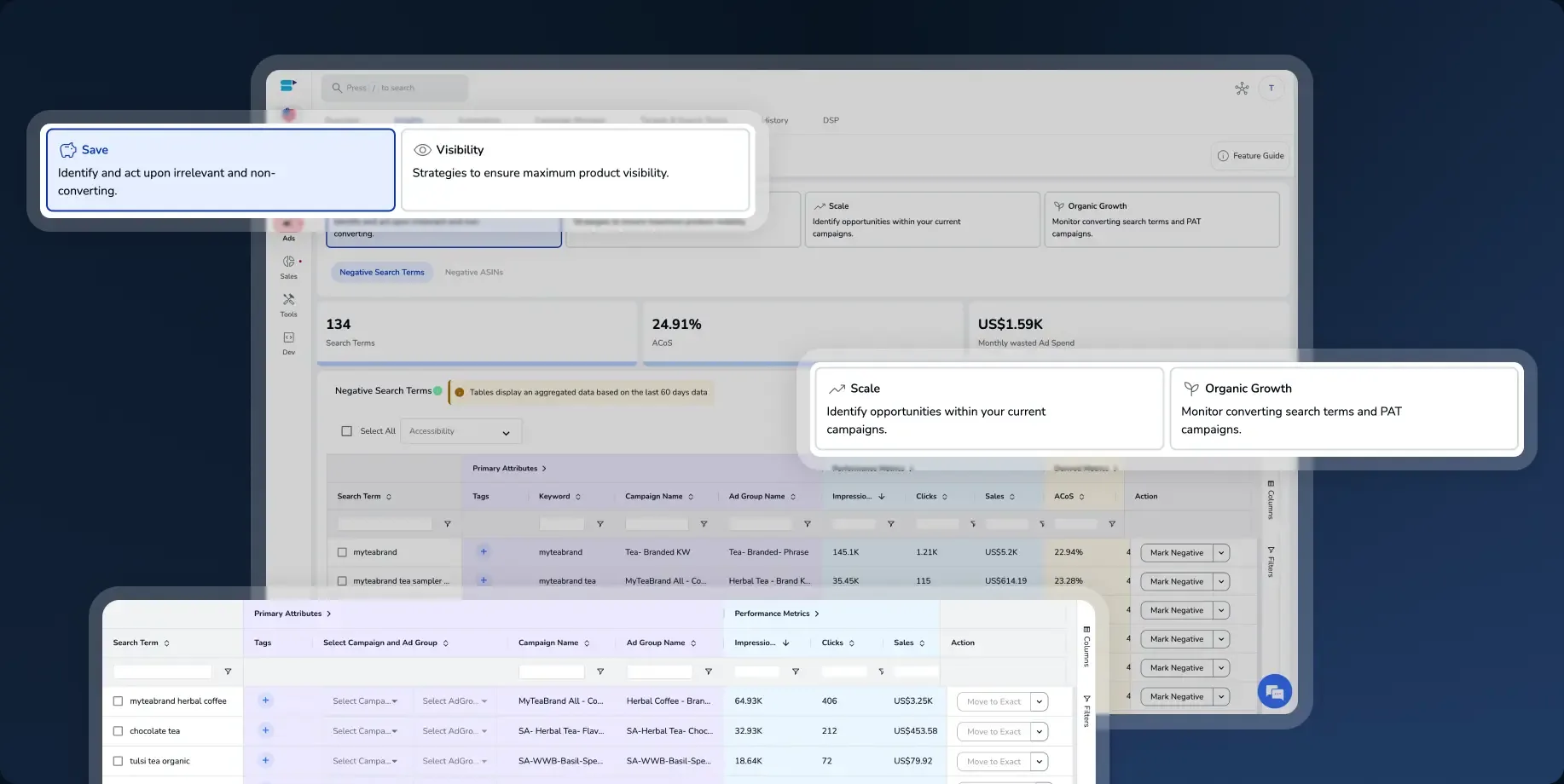
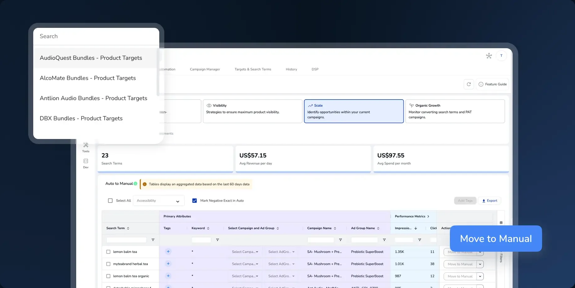
Underneath the tabs, one small set of parts does all the work. A four-up metric header that always reads the same way: value, change, and the window it is being compared against. A table that behaves identically whether the rows are campaigns, targets or search terms — same column controls, same inline edit, same bulk bar. A rule builder whose rules are named for what they do, Target Harvester, ROI Maximizer, Wasted Click Eliminator, Inventory Refactoring, and which reports back in money and hours saved rather than in events processed.
The heavy jobs got the same treatment. Marketplaces became a switcher rather than a separate login. Bulk work became a spreadsheet you export with the exclusions already ticked and upload back over the same screen. Guidance became a chip attached to the thing it refers to, so the advice sits beside the control that acts on it.
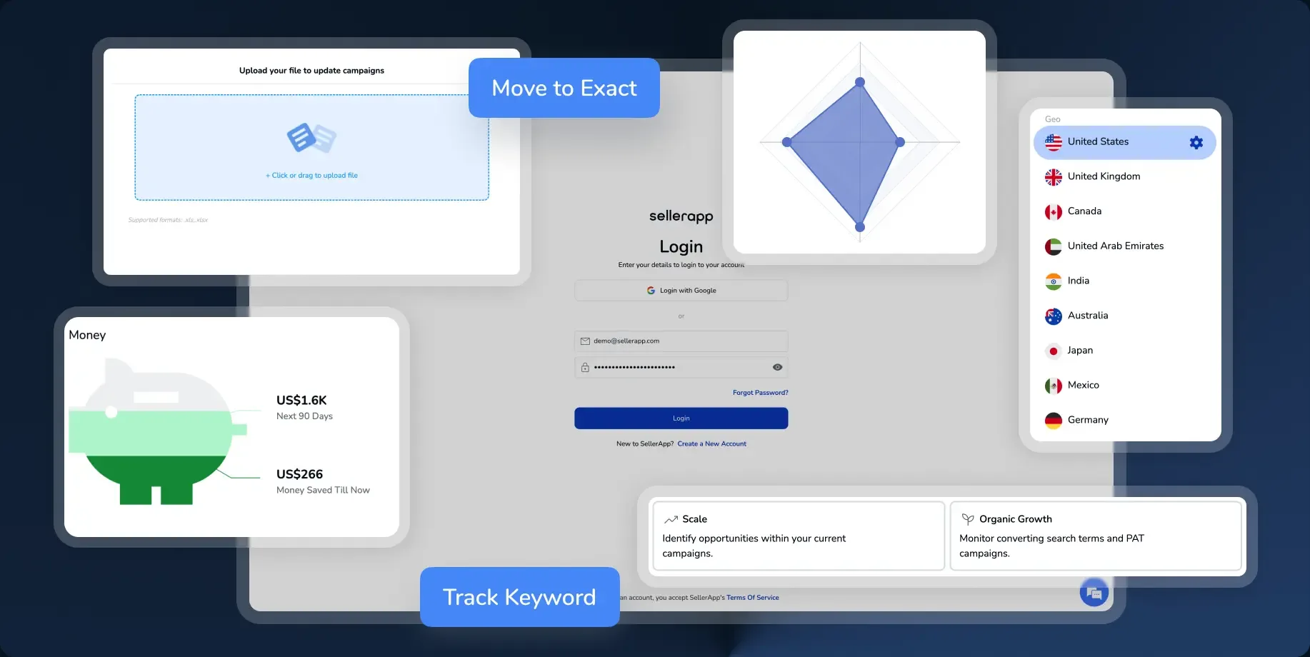
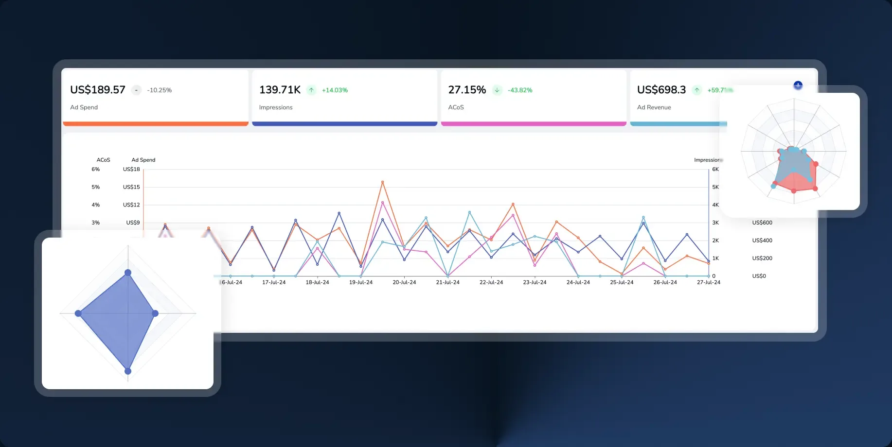
One vocabulary: switcher, upload, radar, callout, action pill, sign-in.


Those parts were then rebuilt as a responsive web kit, so the marketing site could be assembled rather than art-directed page by page. Type scale, spacing, card, tab, stat row, proof block, feature list: one vocabulary, one set of breakpoints, and page templates that hold their shape from a 1440 desktop down to a 414 phone.
It shows in what the public site is made of. The hero is a bento of product fragments rather than a stock illustration. The proof block, the four solution cards and the feature lists are the same components refilled with different content.

The same page at 414px.
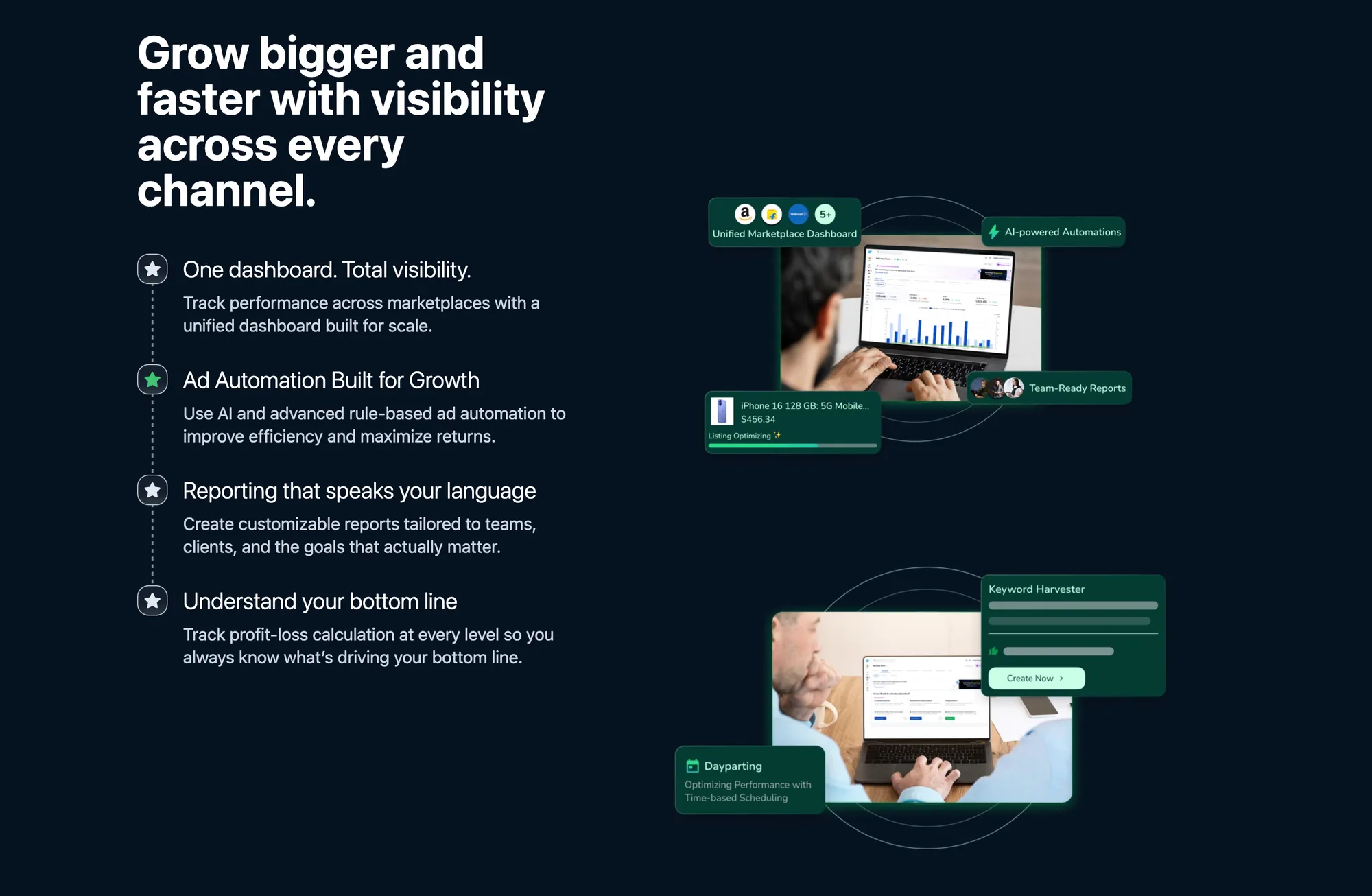
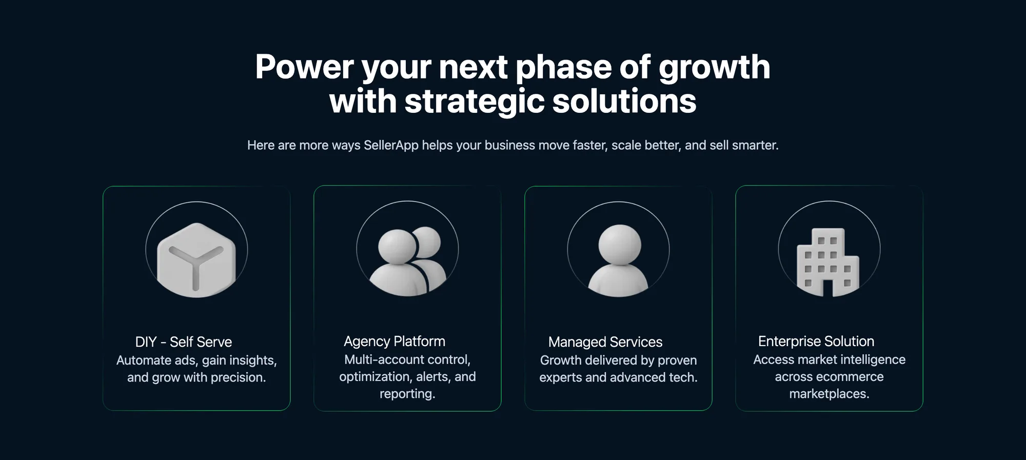

The workspace is in production. The ads overview, the automation layer, the marketplace switcher and the bulk tooling all ship in the live product, and the same component set carries the public site from the homepage down to a single tool page.
The test of a system like this is never the first screen it makes — it's the tenth. A new tool page is now an arrangement of parts that already exist, which is the entire reason to build the parts first.