InboundIQ
Outbox Labs · 0 → 1 Product
Introduction
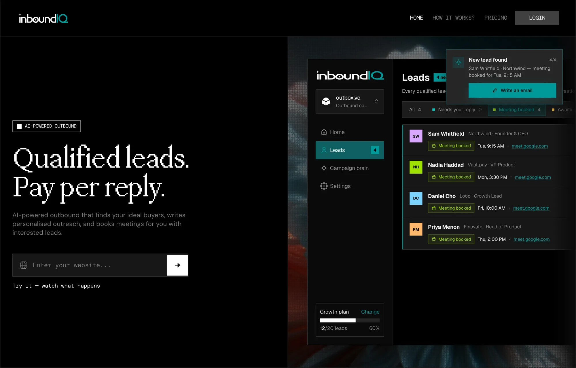
InboundIQ ships intent without the warehouse. I designed and built the whole thing end to end (sourcing signals, scoring, outreach) into one surface lean teams can actually run from. 100+ leads landed in the first 24 hours of the MVP.
Details
Introduction
In 2026, Outbox Labs introduced a new way of generating leads: instead of paying for email infrastructure, warmup tools, or generic sequences, teams simply paid for qualified leads. This flipped the traditional outbound model and tied pricing directly to outcomes.
Because this model was unfamiliar, design was critical to the rollout. The interface had to explain a new mental model while feeling as simple as a typical outbound tool. We used clear messaging, focused hierarchy, and guided flows from setup to first lead to build trust in the model and help users immediately understand what they were paying for.
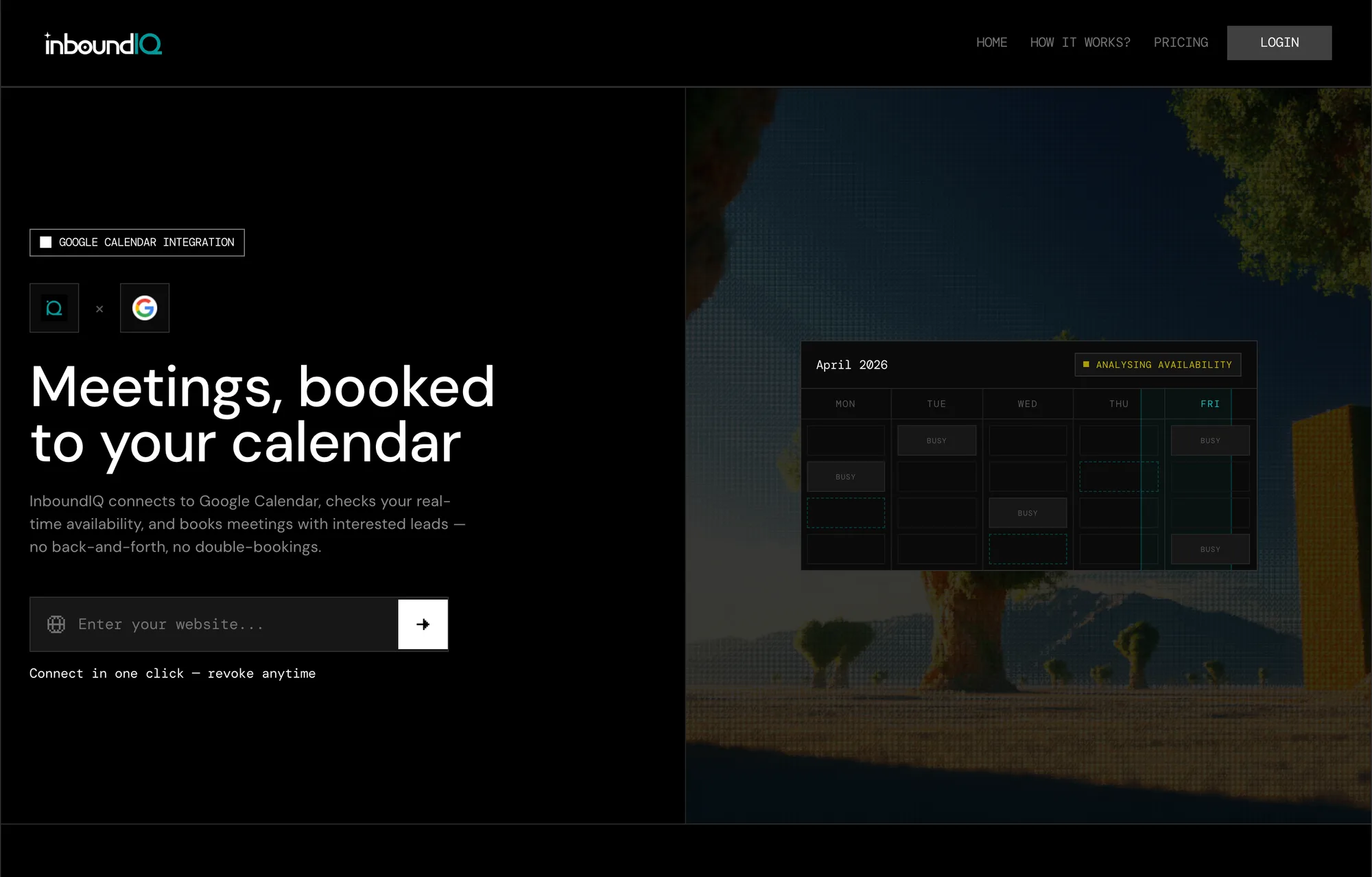
Outbound tools sell capacity — seats, credits, sending volume — and you pay whether or not anyone answers. Charging for the outcome instead meant the interface had to carry an argument as well as a workflow: every surface had to keep answering what counts as a qualified lead, and what this month has actually cost.
The harder constraint was time. A product whose value arrives asynchronously is close to impossible to show — the first lead landing, the meeting getting booked, the quota running out all happen days apart. So the prototype made time a control. A scenario switcher sits in the corner of every signed-in screen and moves the whole account between five states of its life, crossed with the plan and the campaign brain's publish state. One click and you are looking at week six.
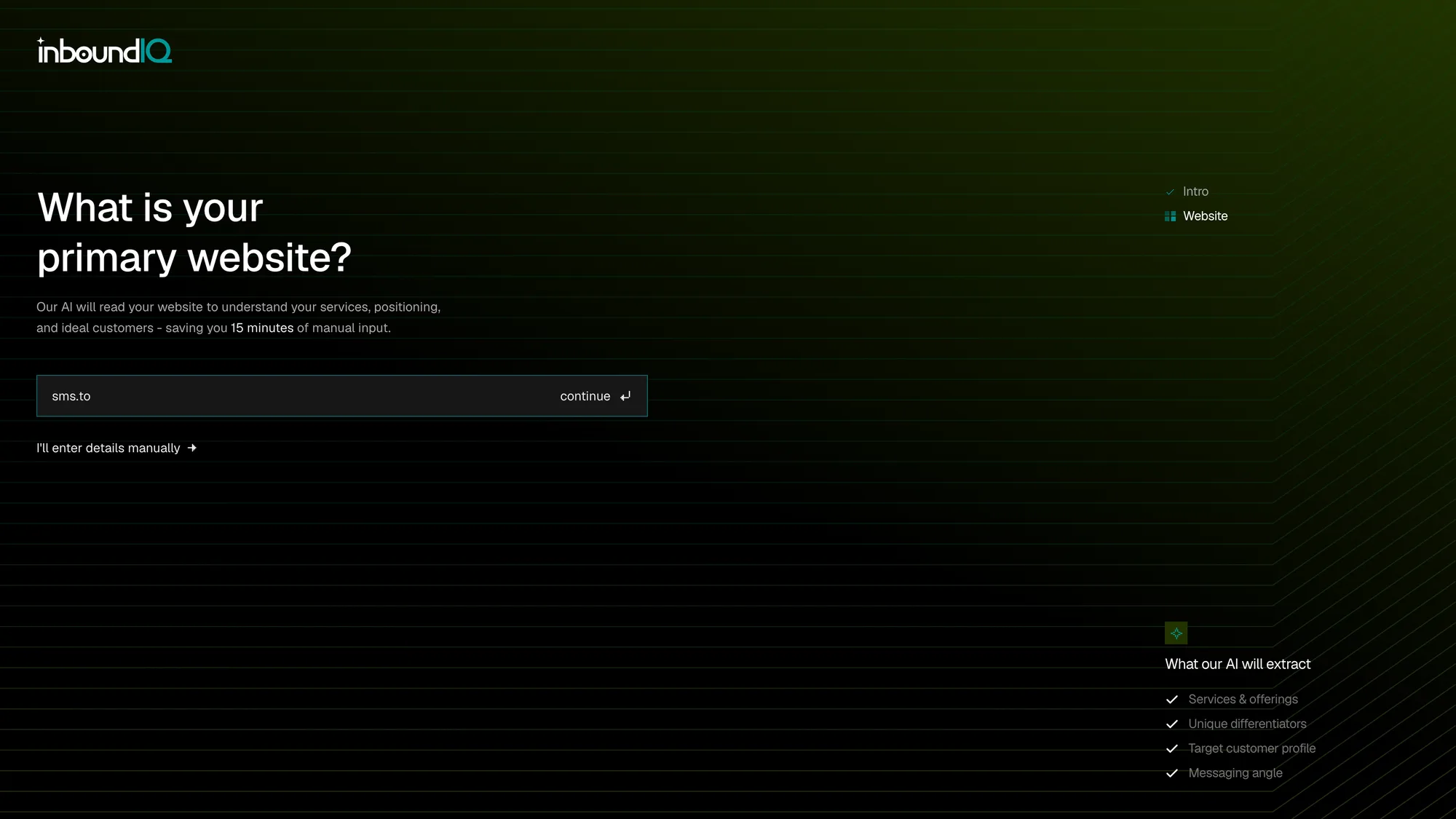
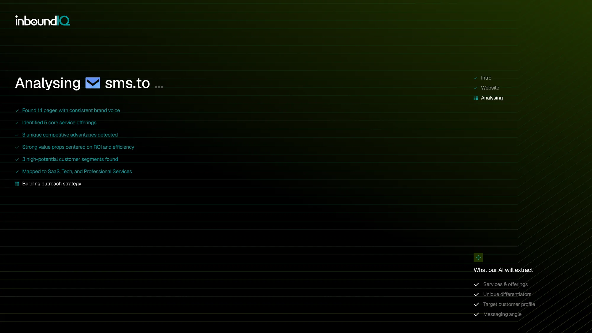
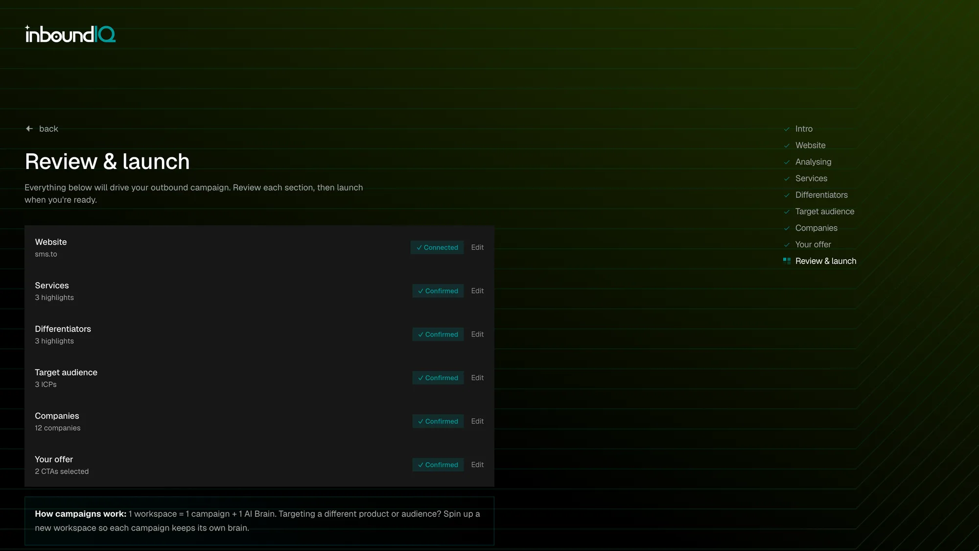
Onboarding is nine steps, and the first one does the work. You hand over a URL; the product reads the site and comes back with your services, differentiators, audience and offer already drafted, so every step after it is a correction rather than a blank field.
Analysing exists to make that reading visible. The whole model rests on believing the thing understood your business, so the pages found and the positioning it picked up land one at a time before any of it is handed over to edit. Review & launch then restates every decision in a single list, so nothing goes live that the user has not seen twice.
Leads carry the promise, so the same set gets two shapes: a list for triage and a board for stage. Opening one explains its intent score instead of asserting it — a panel names the ICP the person matched and the buying signal in their reply, then breaks the number into ICP fit, reply intent, seniority and engagement, so a score you disagree with is arguable rather than opaque.
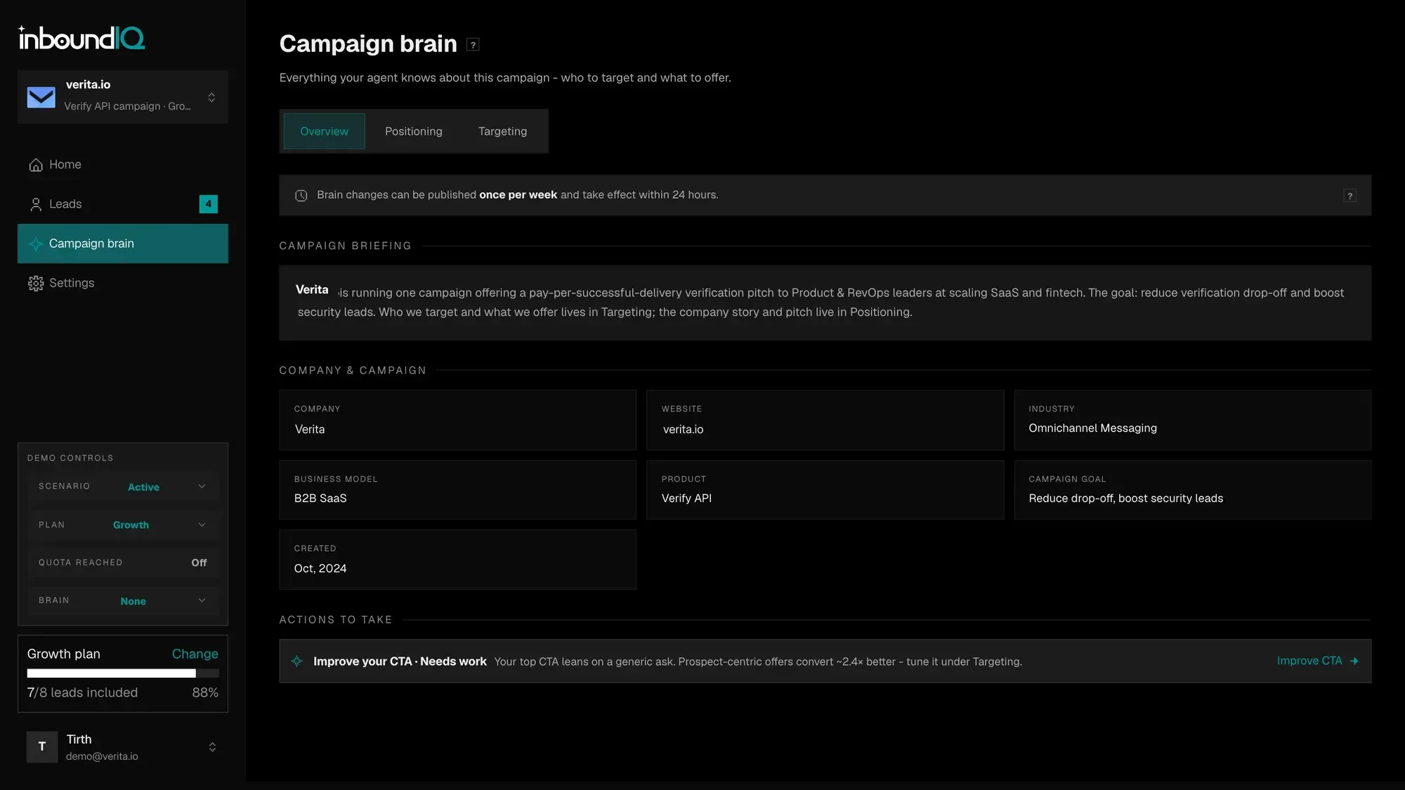
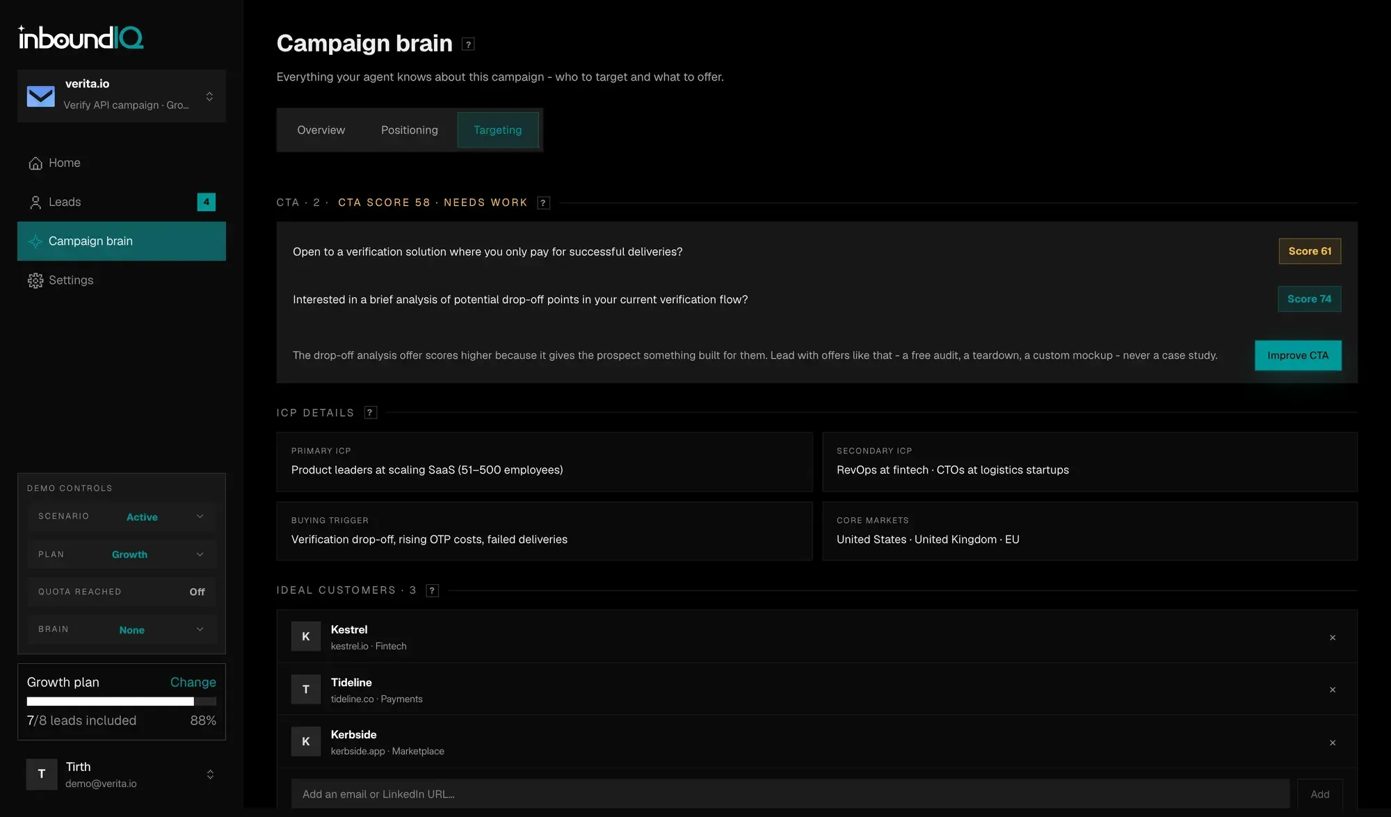
Behind all of it sits the campaign brain: the editable model of the business the agent works from — positioning, targeting, ideal customers, and the CTAs it leads with, each scored. It publishes on a lifecycle rather than saving silently, so edits queue as unpublished changes and the screen states plainly when they will take effect.
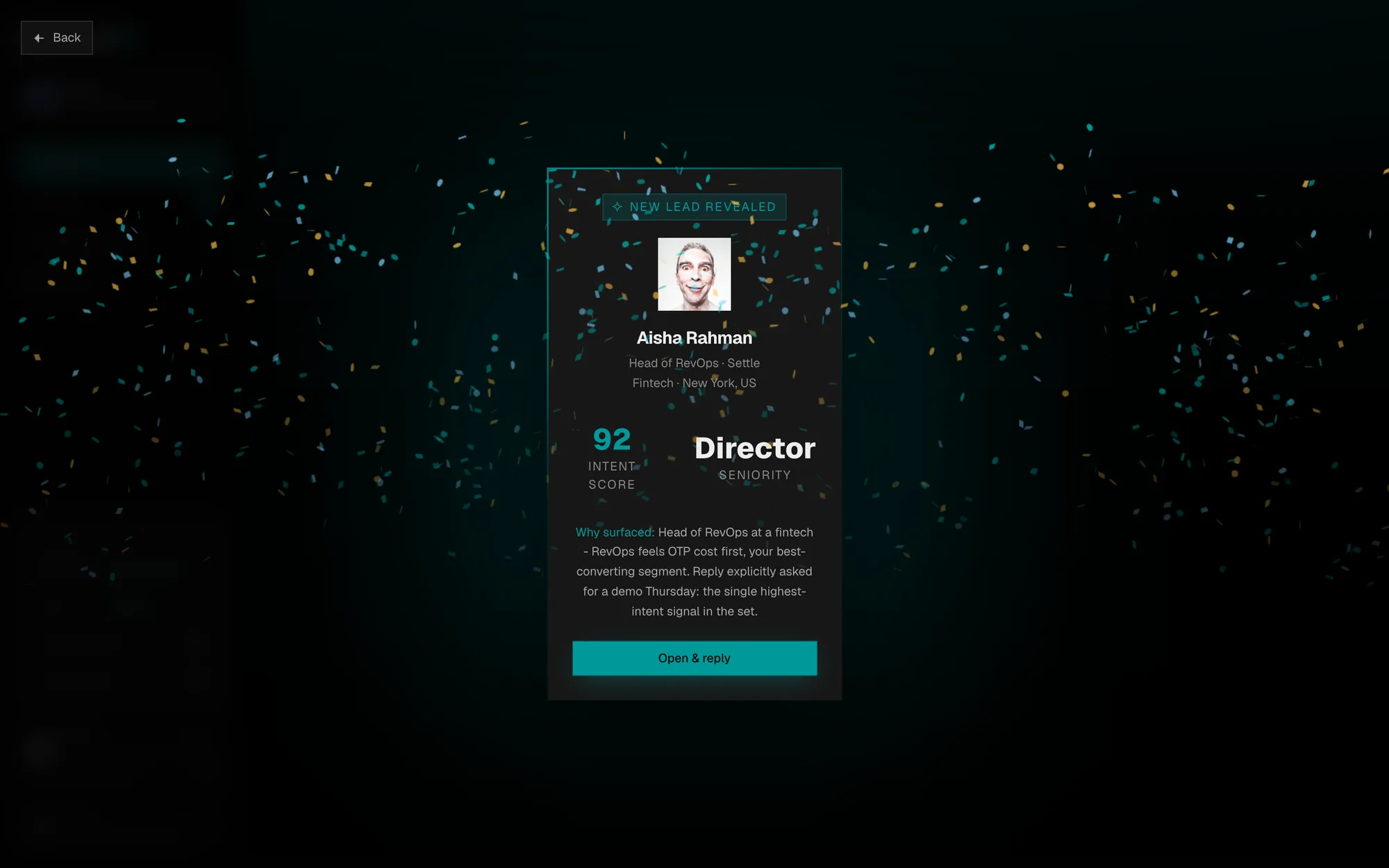
The first qualified lead is the moment the whole model is selling, so it gets a screen of its own: a full-bleed reveal with the person, their score and the reason they surfaced, before anything else in the app can be touched.
Marketing site, nine-step onboarding and the signed-in product, designed and built end to end in a month — two design languages sharing one set of tokens, the public side black, dithered and scroll-driven, the app a content card inset from the page behind a sticky sidebar. The MVP landed 100+ leads in its first 24 hours.
Case Study