InboxInfra
Outbox Labs · Website & Art Direction
Introduction
Details
Introduction
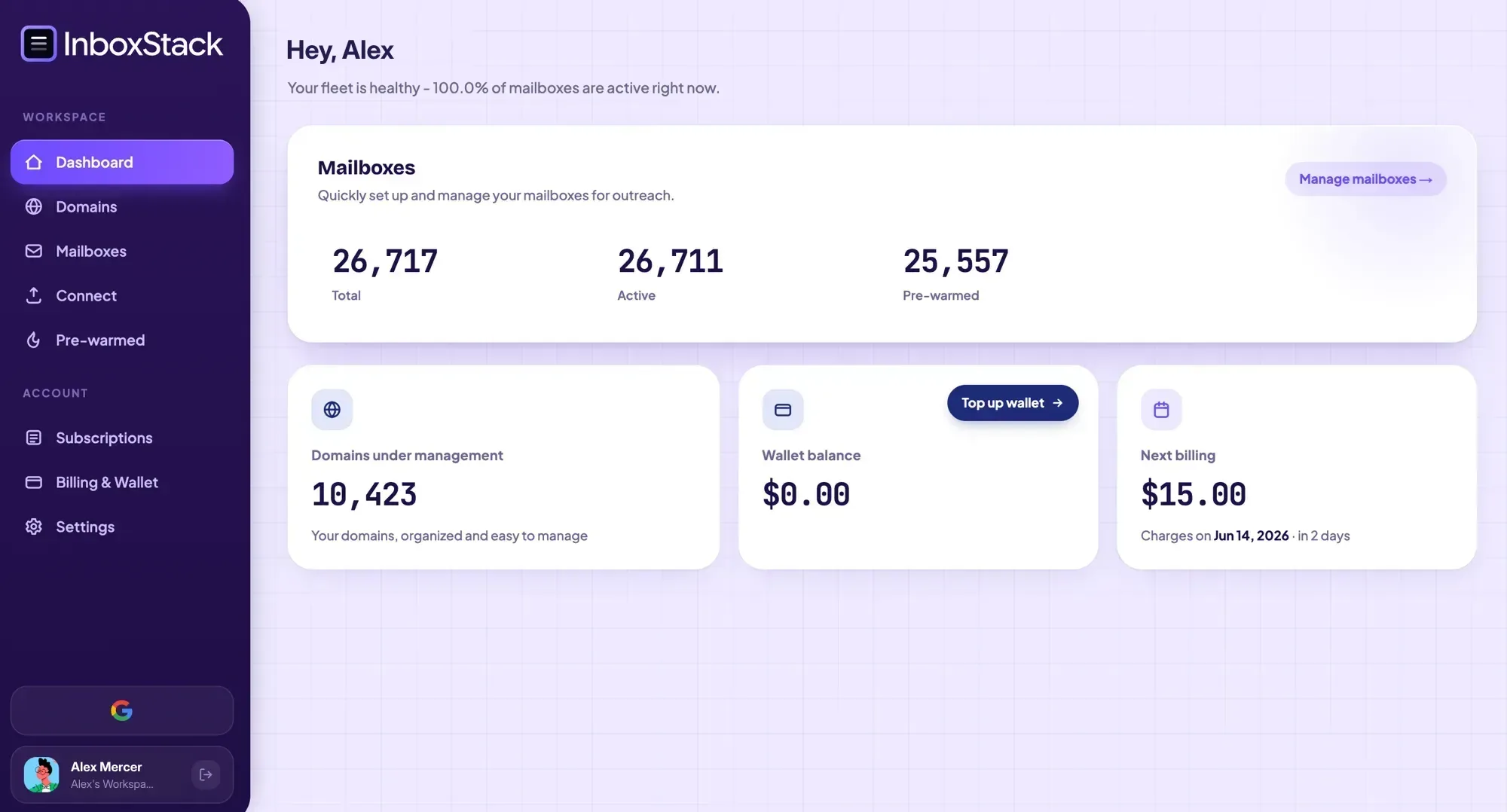
InboxInfra sells cold email infrastructure as a purchase rather than a project. Google and Microsoft mailboxes on US and EU IPs, DNS handled for you, warmed and wired into whichever sequencer you already run. The product itself lives at app.inboxinfra.com, in a different codebase. This project is the front door: five pages, fourteen live sections, and the documents you agree to when you buy.
It was designed and built from a single specification. Before any component existed there was single-shot-website.md, a 395 line document covering the stack, the palette, the typography, the motion language, every section's copy and behaviour, and an acceptance checklist to grade the result against. The site was generated from that file in one pass, and the file is still the design system of record.
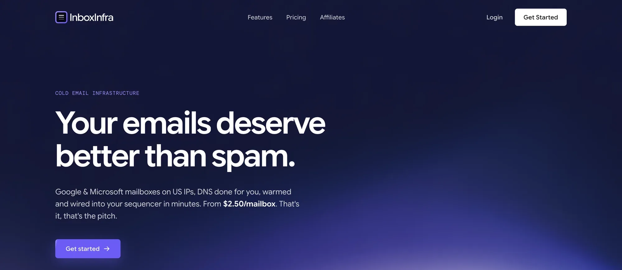
Cold email fails on infrastructure long before it fails on copy. Domains, DKIM, SPF, DMARC, mailbox provisioning, a warmup ramp, then wiring the whole stack into a sequencer. It is a spreadsheet job, and the category around it sells with demo calls and pricing behind a form. The brief was to argue the opposite in public: show the flow, show the price, let someone sign up without talking to anybody.
The constraint that shaped everything was scope. The app already existed elsewhere. This repository would never authenticate anyone, never hold a dashboard, never expose an API, and it does not: there are no route handlers and no environment variables. Every call to action hands off. What it had to carry was the argument and the terms, which meant the whole thing could be decided up front, on paper.
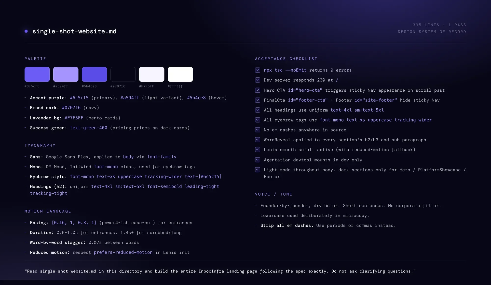
single-shot-website.md, the spec the site was generated from, quoted verbatim.
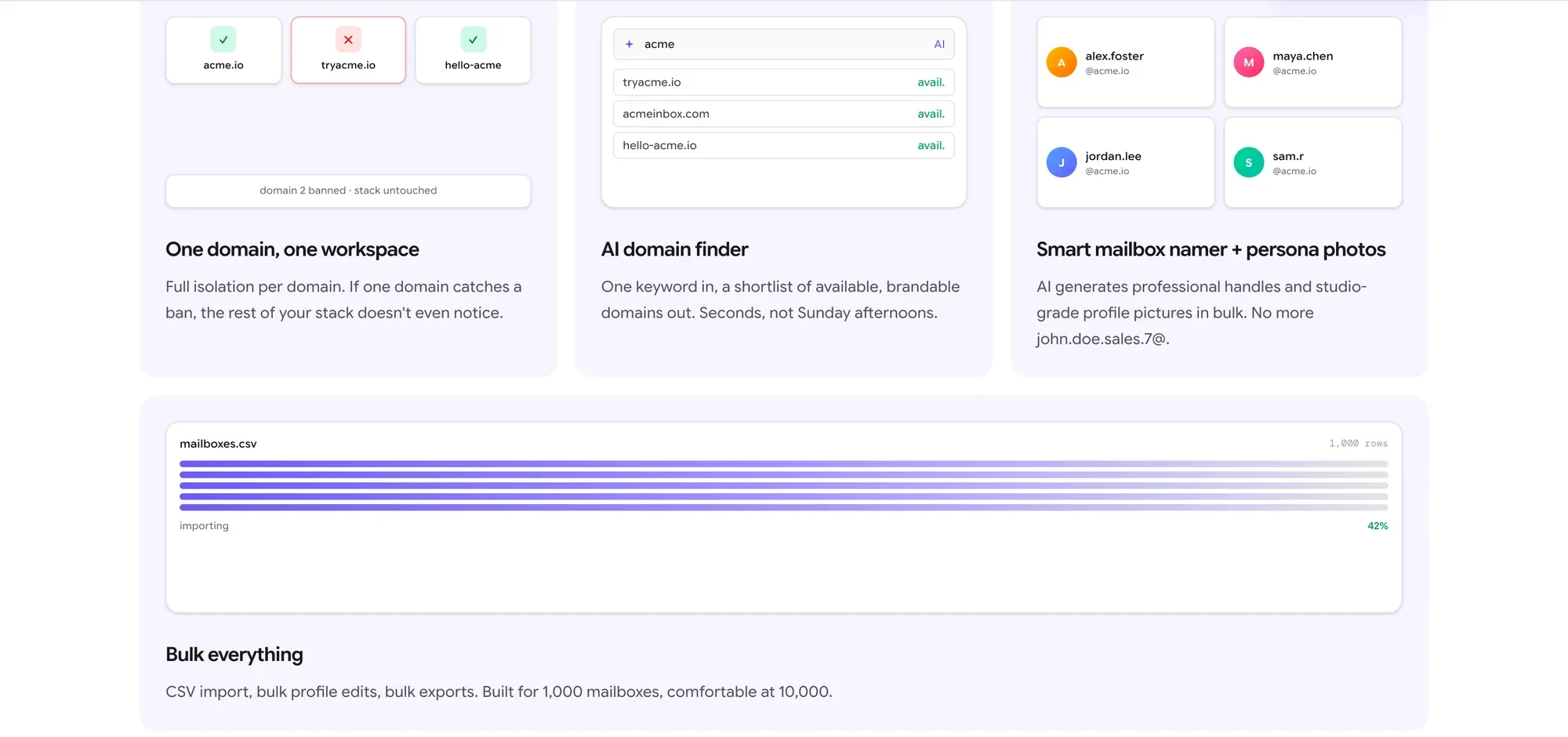
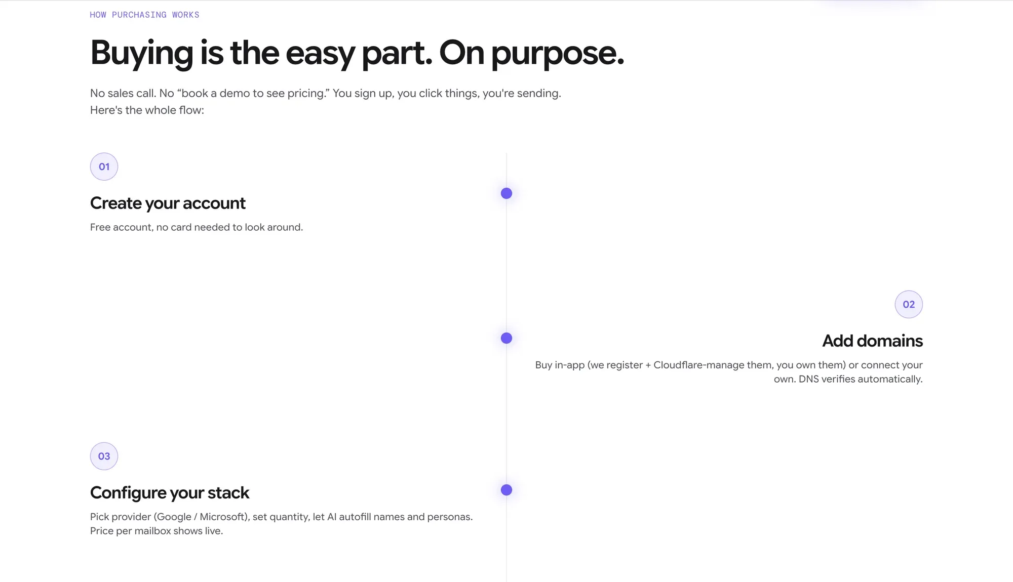
Writing the spec first meant making each decision once instead of forty times. One accent purple, one brand navy, one lavender for every bento card. Google Sans Flex throughout, DM Mono reserved for eyebrow tags, and a single heading size that every h2 on the site uses without exception. Motion got the same treatment: one easing curve for entrances, one duration band, a word by word reveal on every section heading, and a reduced motion fallback wired into the smooth scroll setup. The spec even fixed the voice, down to a rule banning em dashes from the source.
Light runs through the whole page, so the few dark sections do real work. The platform showcase is one of them. It tabs through four views of the product against a purple field, with the interface itself tilted and bleeding off the bottom of the section.
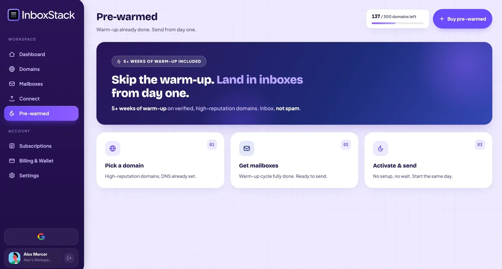
Pre-warmed
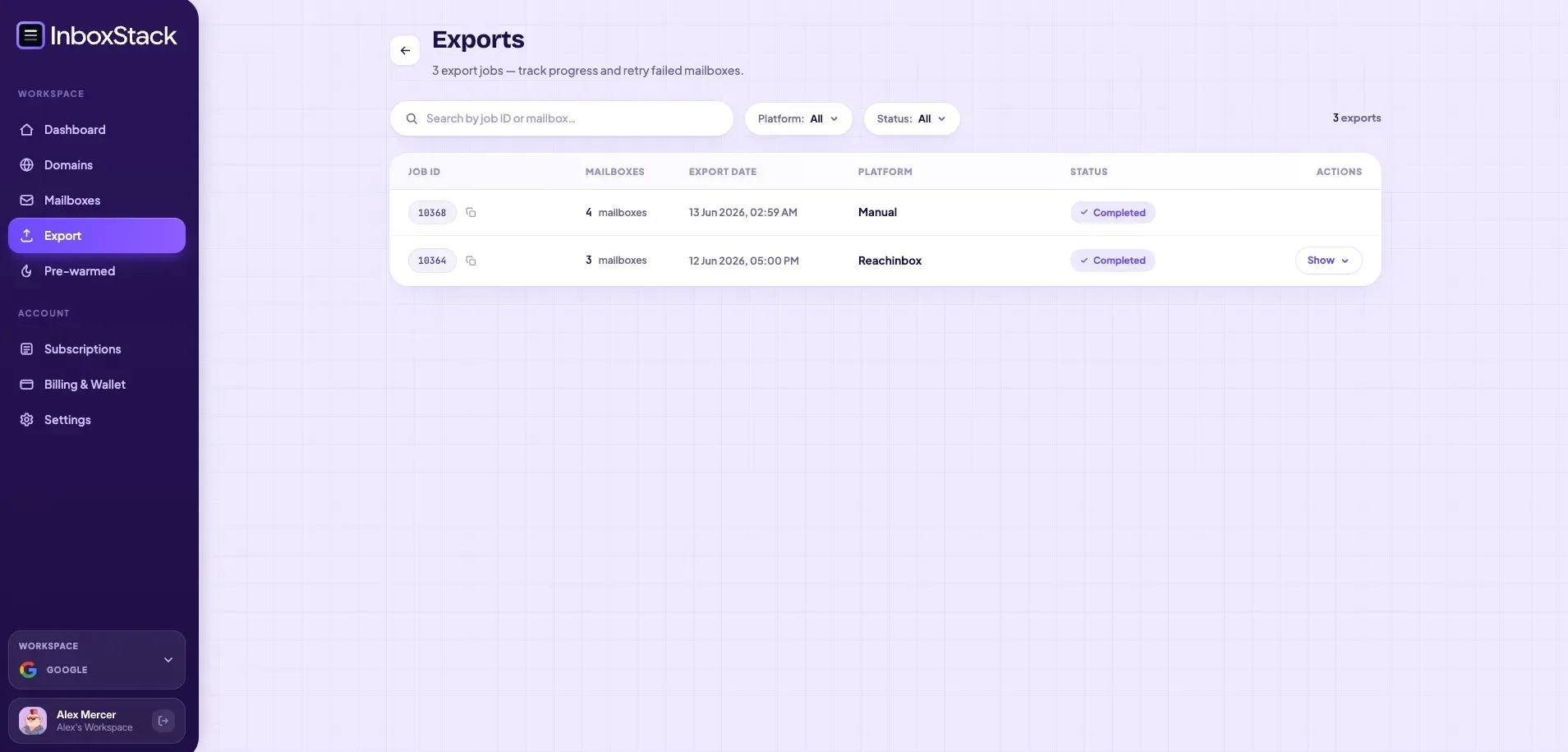
Send
The other half of the repository is the part nobody screenshots. Terms of service, privacy policy and affiliate terms live as 524 lines of markdown inside the codebase, read off disk at request time and rendered server side. The layout strips the H1, keeps the date for the page header, auto-links any bare email address, and renders the rest with table support.
Which means editing the terms is editing a markdown file. No JSX, no component changes, and the legal copy stays reviewable as prose in a diff.
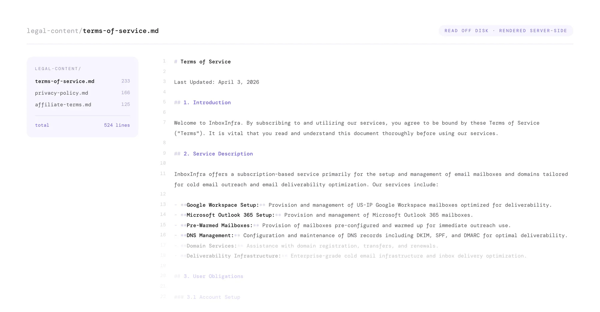
legal-content/terms-of-service.md

The same file, served.
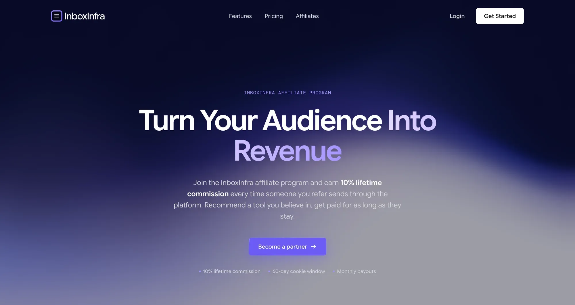
The site shipped as five pages: the landing page, the affiliate program, and the three legal documents. It builds with zero environment variables, and the favicon is generated at build time rather than shipped as an asset. Two finished sections, a how it works block and an API pitch with a typewriter terminal, sit parked in the page file rather than deleted, ready to be switched back on. The landing page is an ordered list of section components, so reshaping it is reordering that list.
The spec is still checked in beside the code it produced, which is the part I would keep. The design system did not evaporate into the components. There is an open list attached to it too: the headline statistics and the testimonials on the live site are placeholders that need sourcing or removal, and two sections still quote an older setup time than the rest of the page. Those are copy decisions for the client, not build work, and they are the next thing to settle.
